From global icons to trailblazing start-ups, we partner with ambitious leaders at pivotal inflection points.


Archive
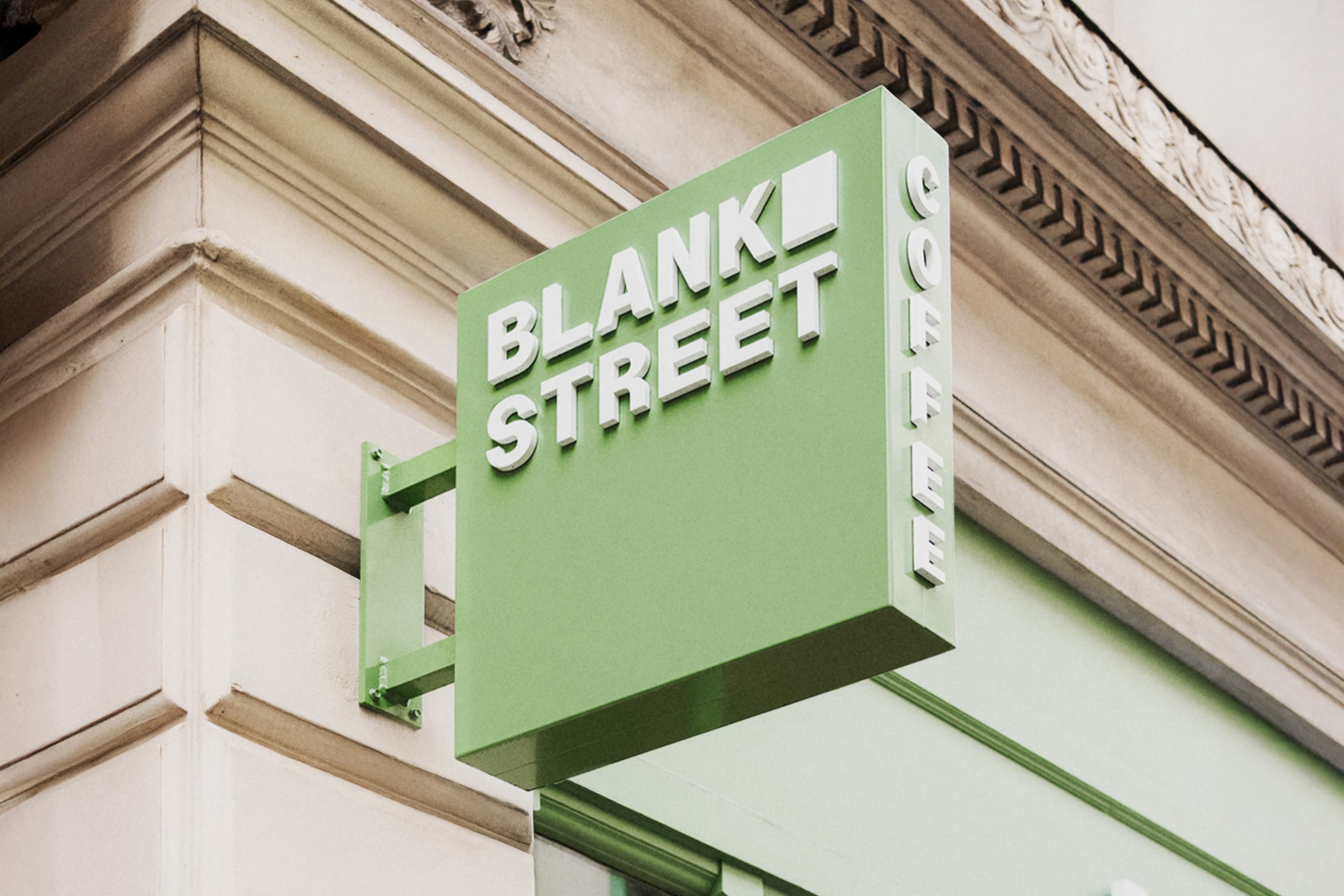
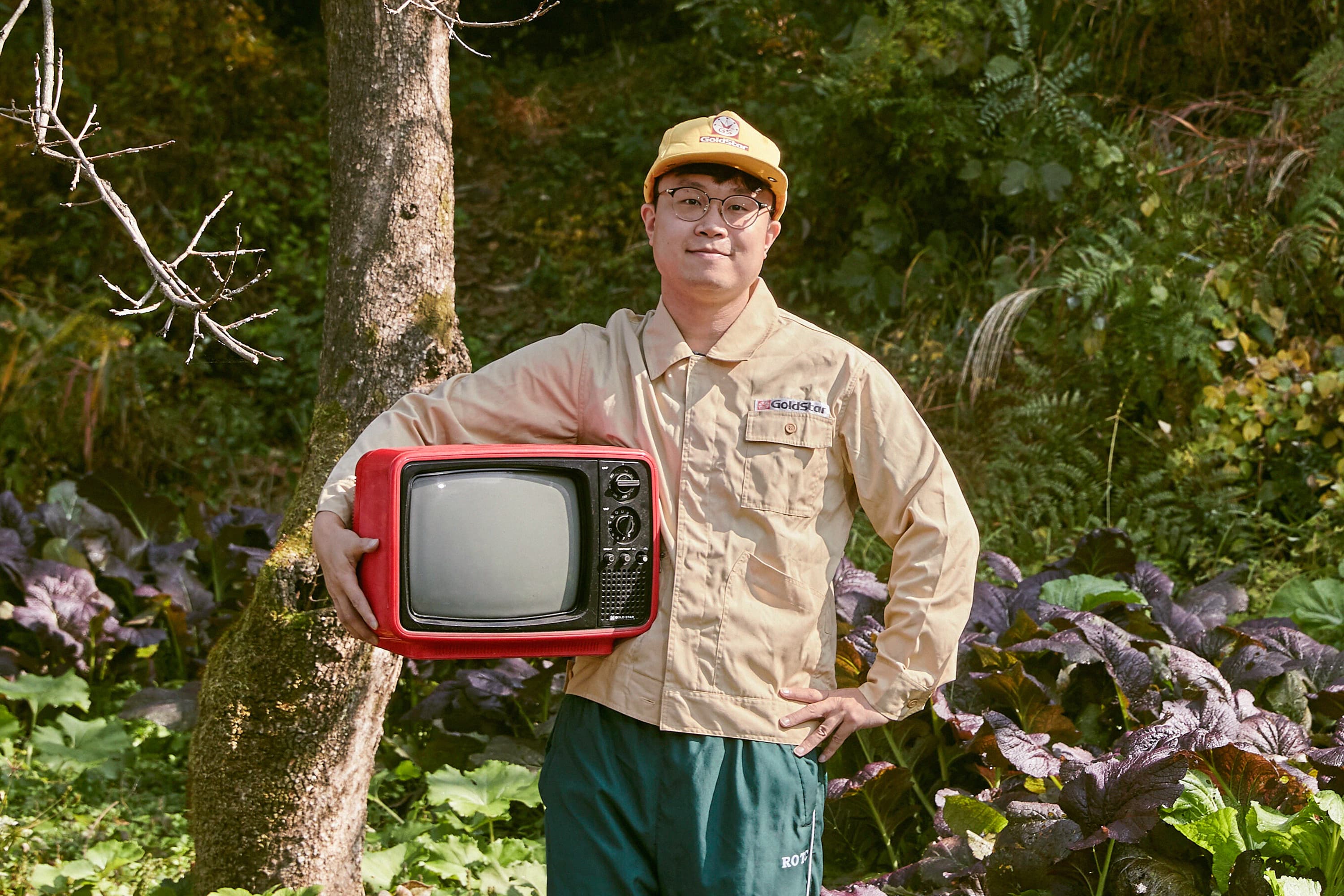
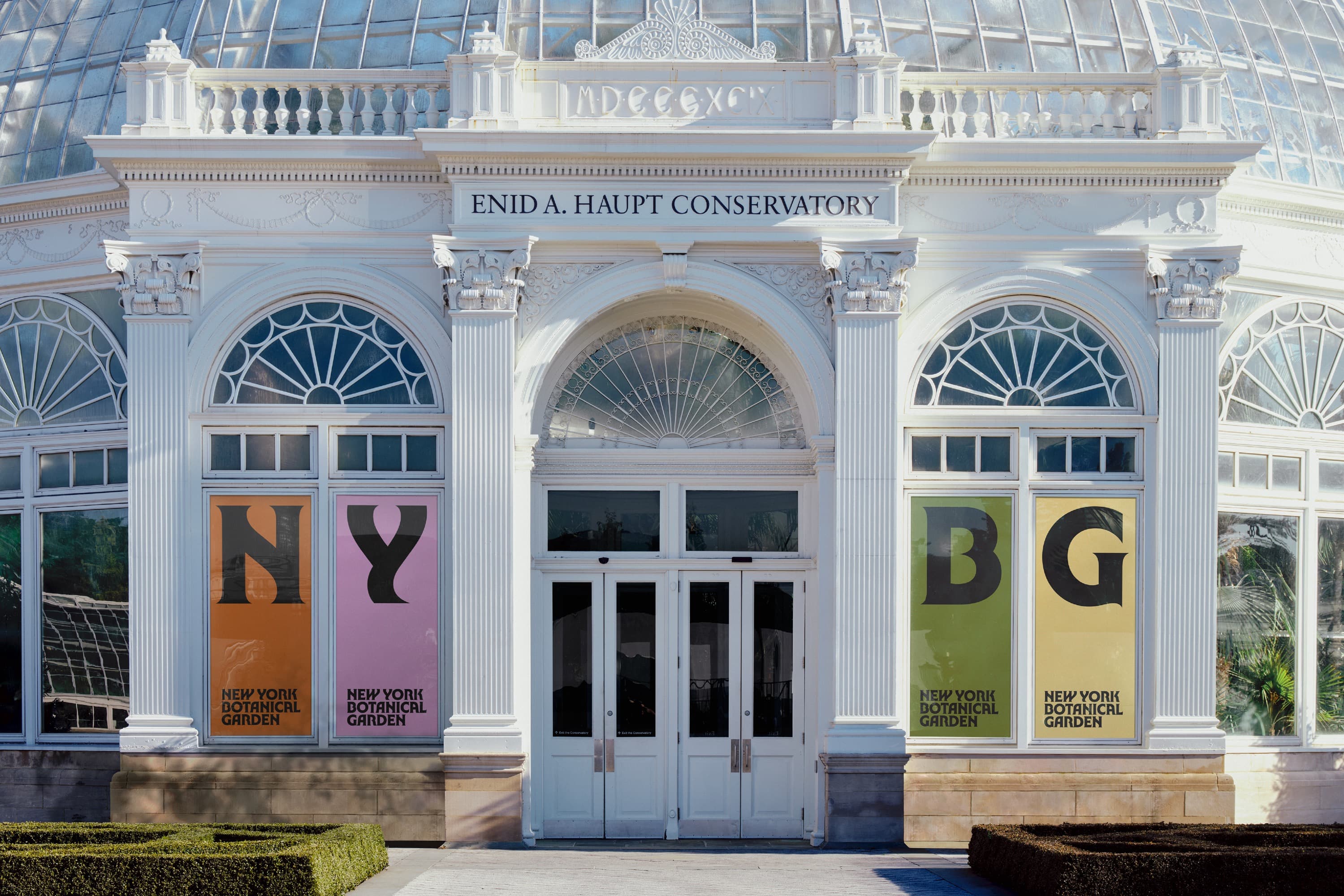
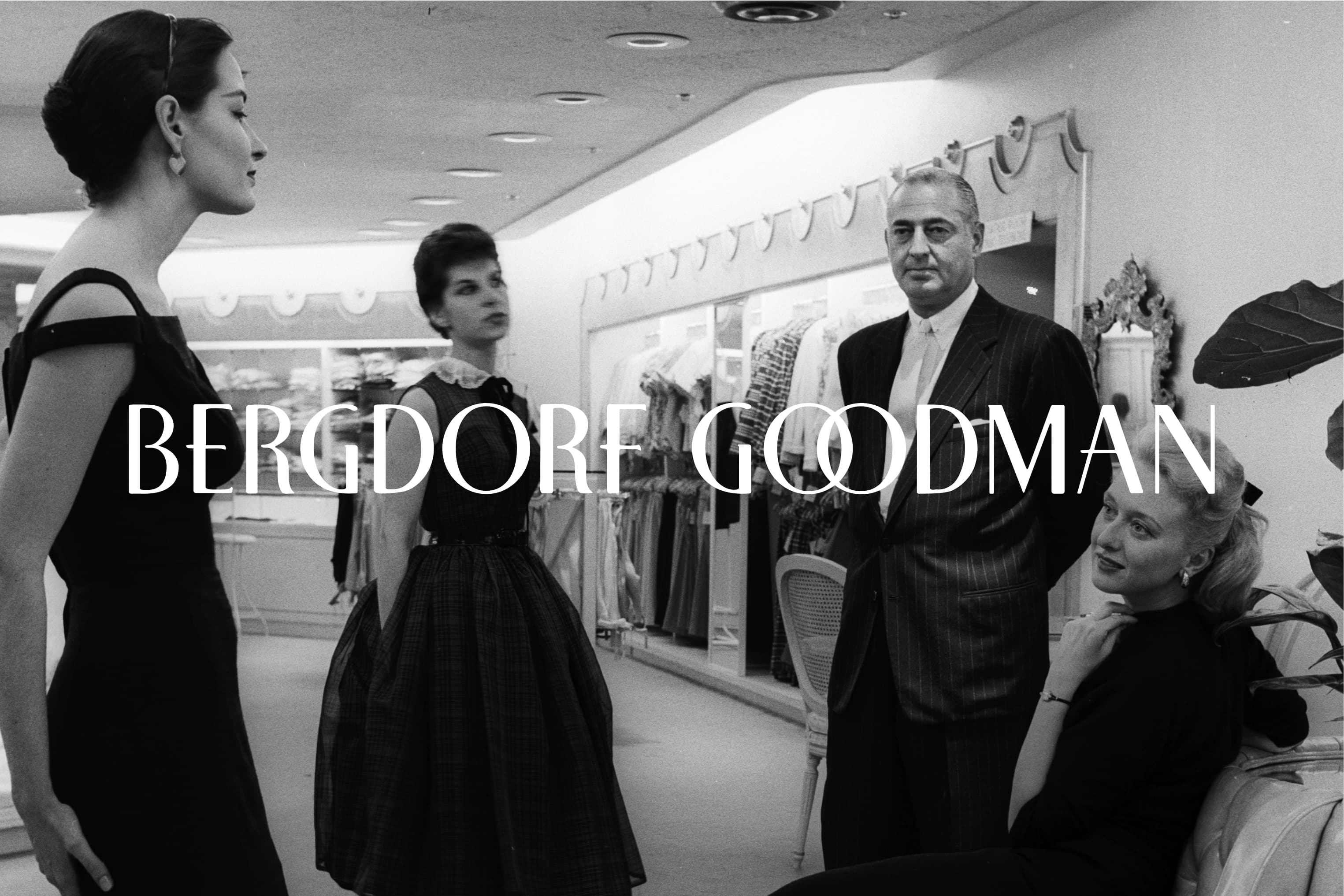
There’s a lot more where that came from. Take a tour through our more than 60 years of transforming brands from cultural institutions to consumer goods, pharma to farming, startups to stalwarts. Whatever the challenge, we stay fueled by our curiosity about the world and our knack for bringing change wherever we go.