Kenvue
Creating a new home for iconic brands
How do you brand a new company with a 100+ year history? That was the question we faced when developing the identity for Kenvue — a new consumer health brand that no one had heard of, even though its products were household names around the world.
In 2021, global healthcare leader Johnson & Johnson announced plans to spin off its $14bn consumer health business, home to iconic brands like BAND-AID and Listerine. Despite its long legacy and beloved product portfolio, the new company was effectively starting from scratch, leaving behind a century of brand equity. This loss was going to impact the brand’s relationship with consumers as well as the company’s 50,000 employees, consultants, contractors and partners, who needed something to stand for as they left behind Johnson & Johnson’s proud heritage.
To set itself up for another 100 years of success, the new company needed a brand that could signal the start of a new chapter, define a new home for its beloved product brands, and rally employees, investors and consumers alike.
A new view of care
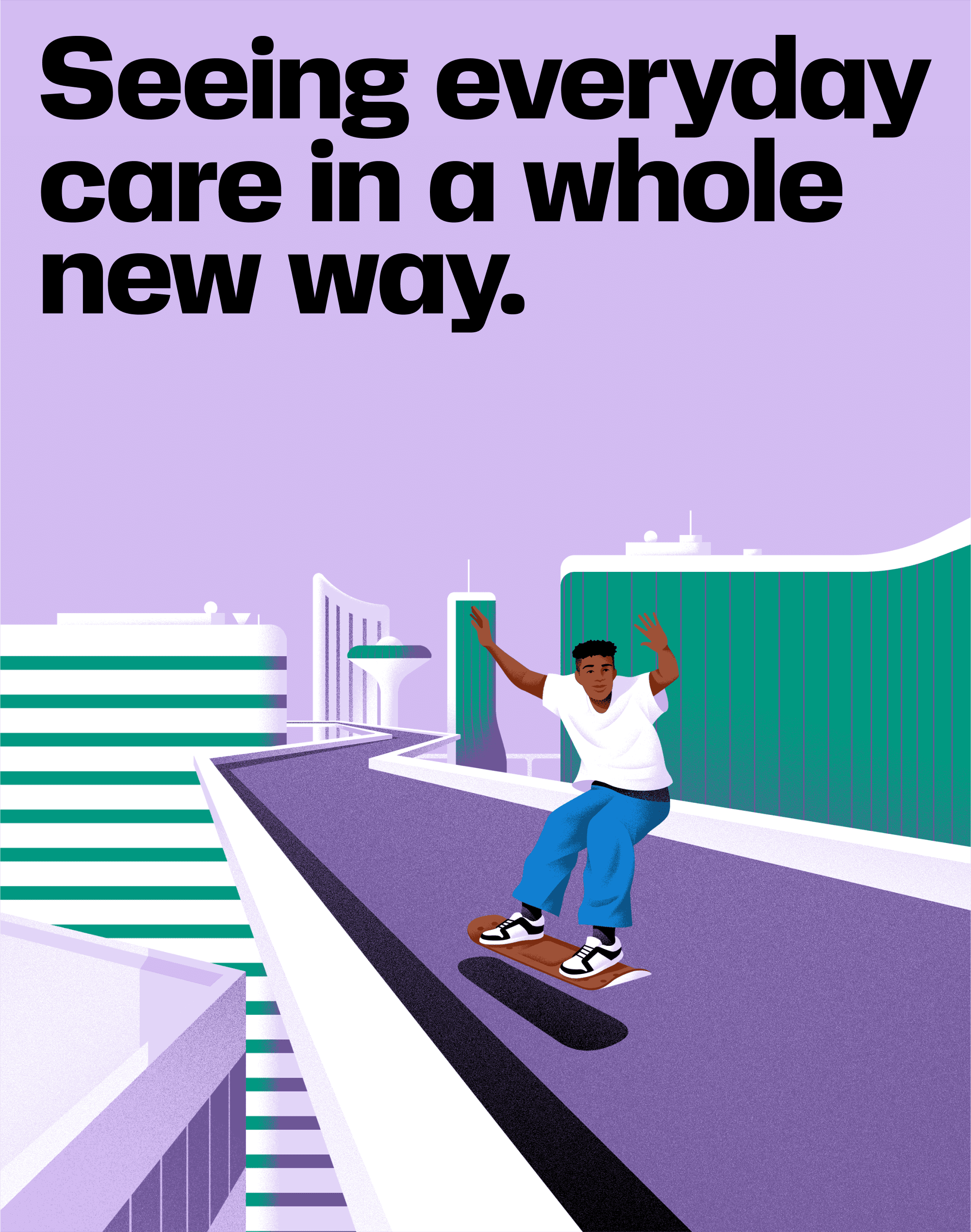
We began our work with a previously defined new brand purpose — realise the extraordinary power of everyday care — and a new brand name: Kenvue. To develop an identity, we explored how this abstract name might become meaningful and emotional. Our inspiration came from within the new name — the vue, cueing that the Kenvue brand could represent a new view of care in the world, born from the brand’s deep commitment to innovating real solutions to personal health needs.
This idea inspired us to create a brand that could set a new standard for how consumer health parent brands show up in the world. Kenvue’s commitment to innovation and care demanded a brand that broke with category conventions to be modern, approachable and expressive.
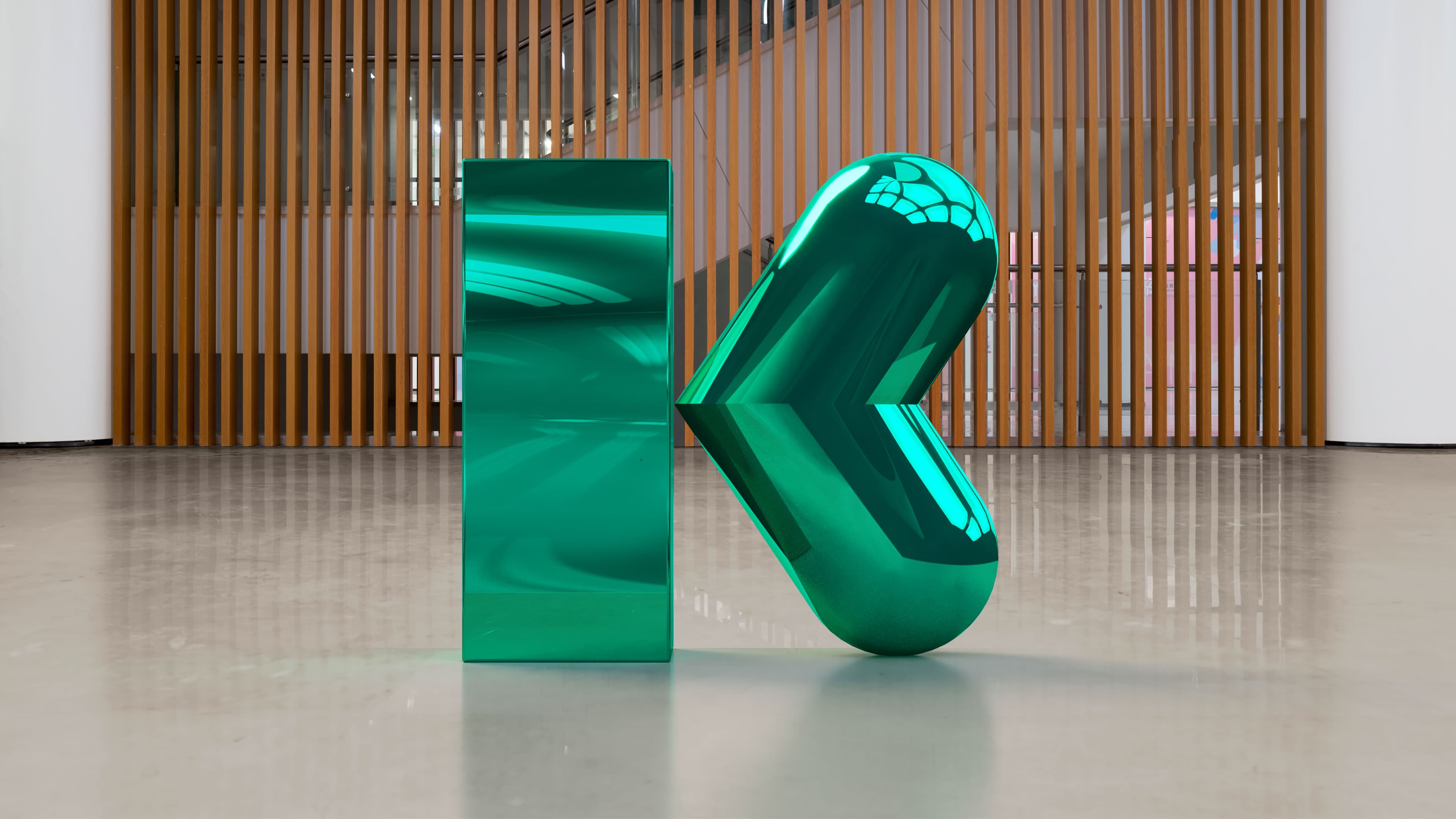
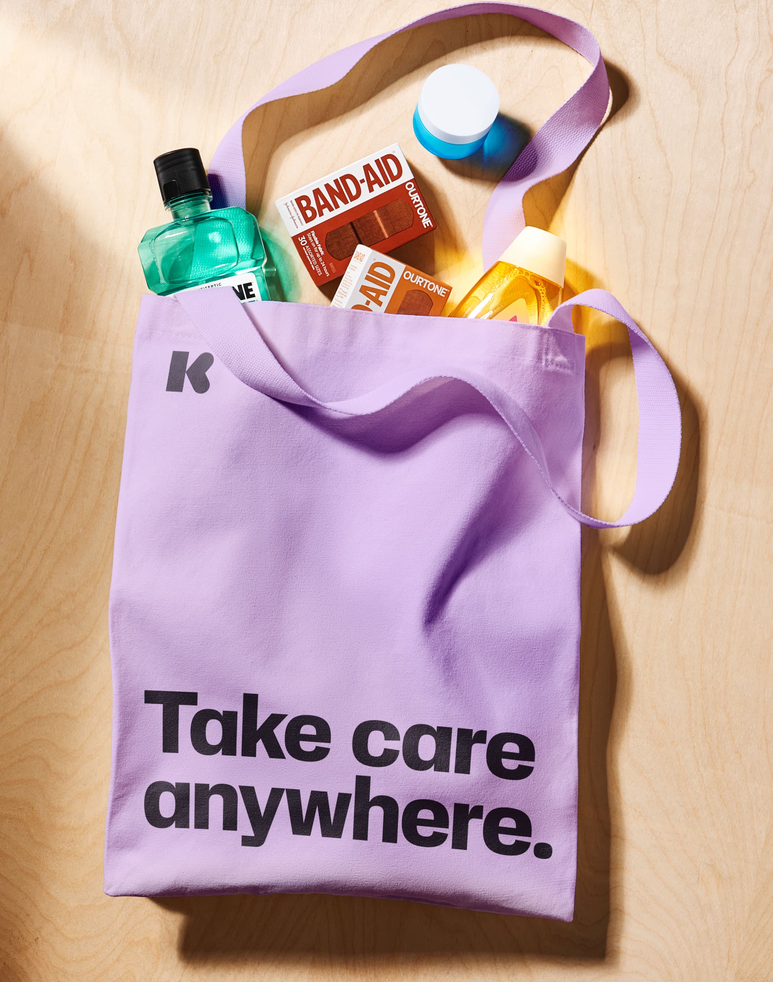
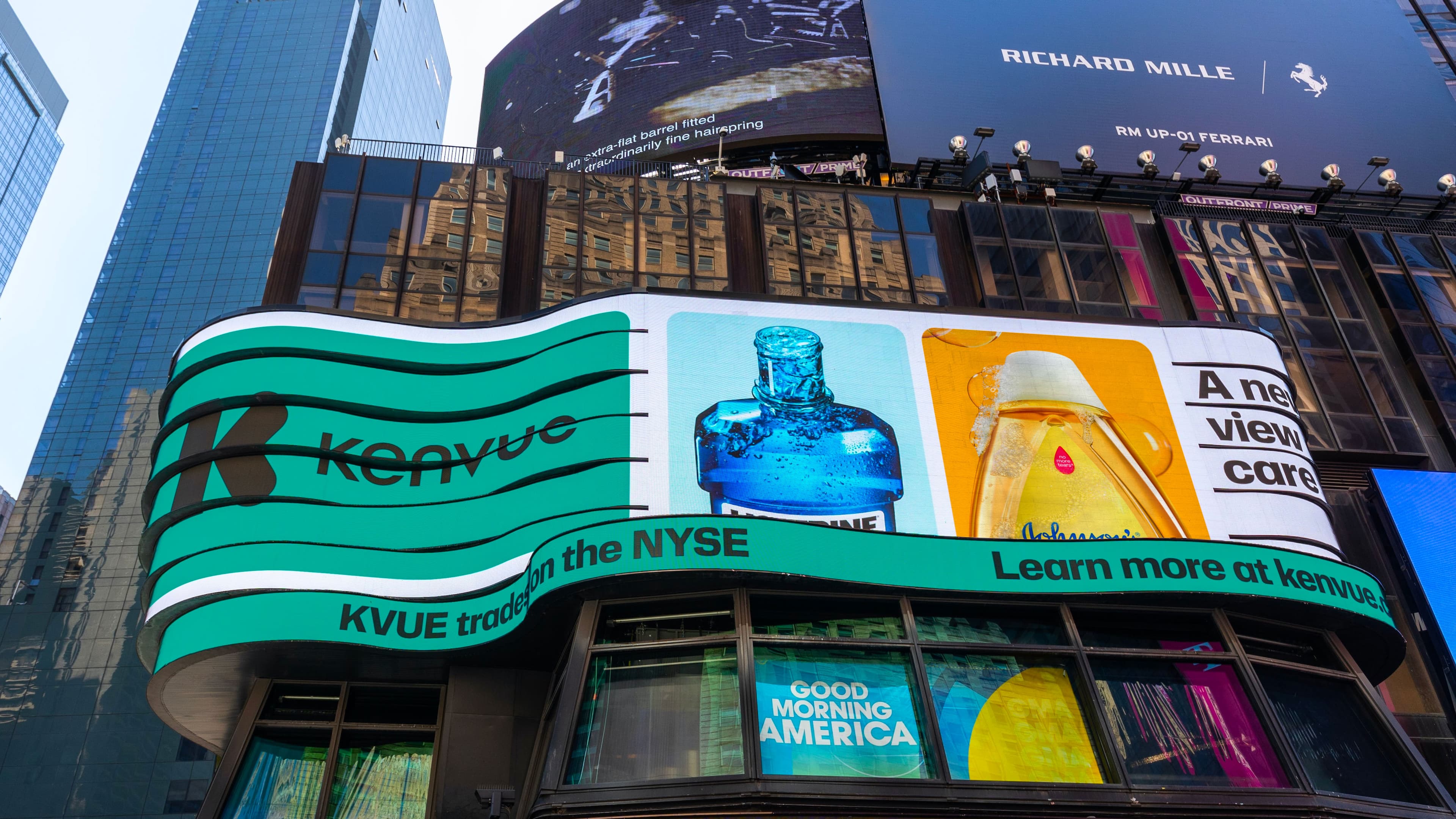
We designed a new symbol to imbue deeper meaning in the name and create an emotional connection with audiences. The resulting mark reflects both the rigour of Kenvue’s innovation and the warmth of its commitment to personal health.
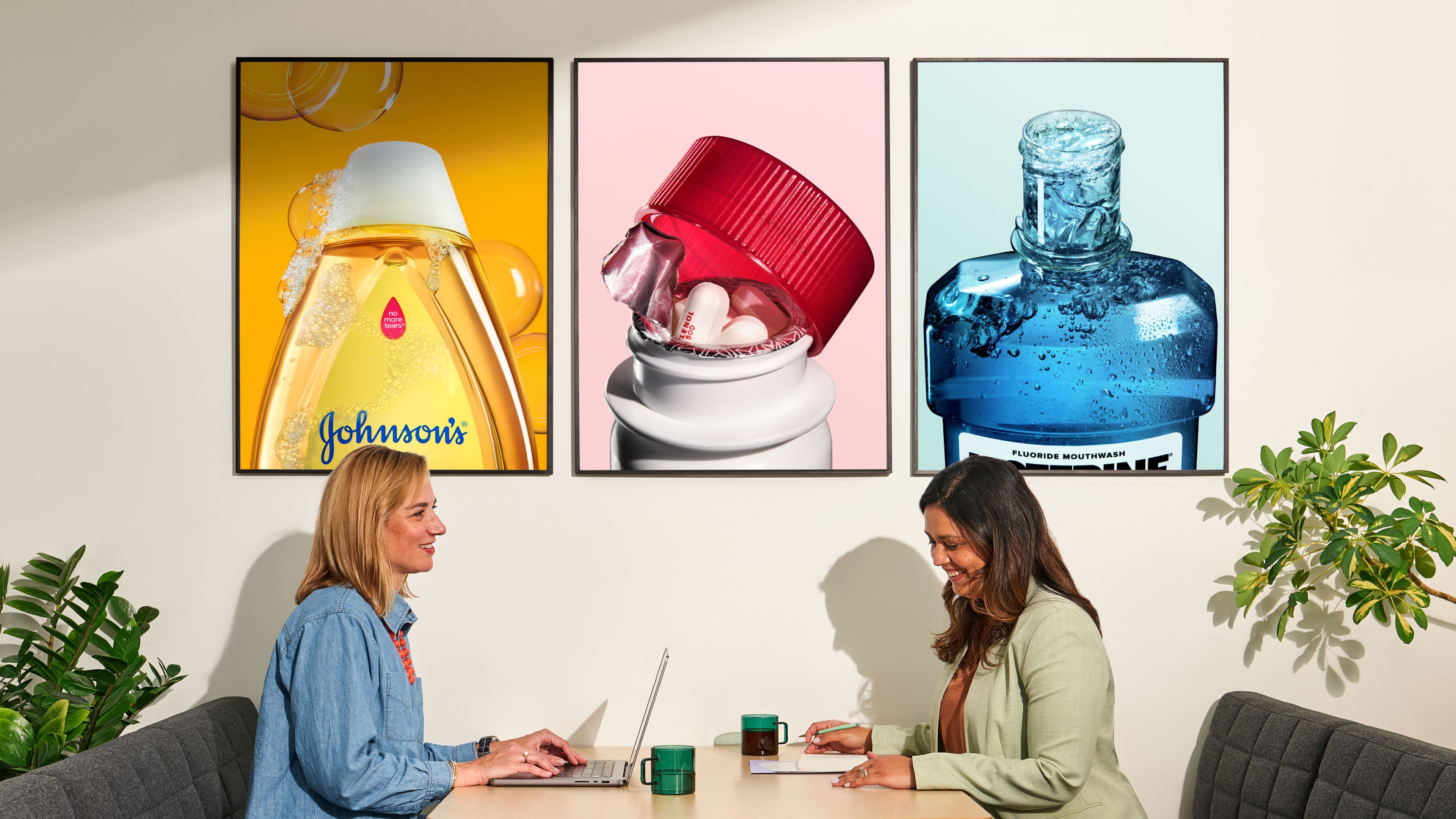
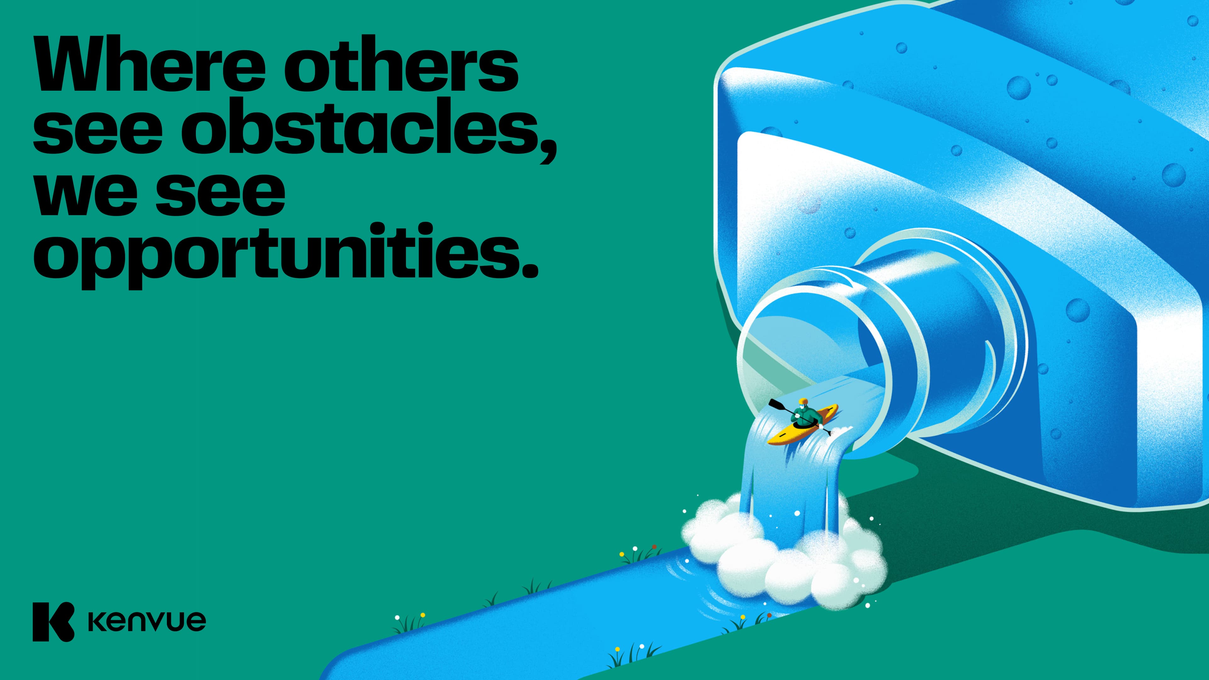
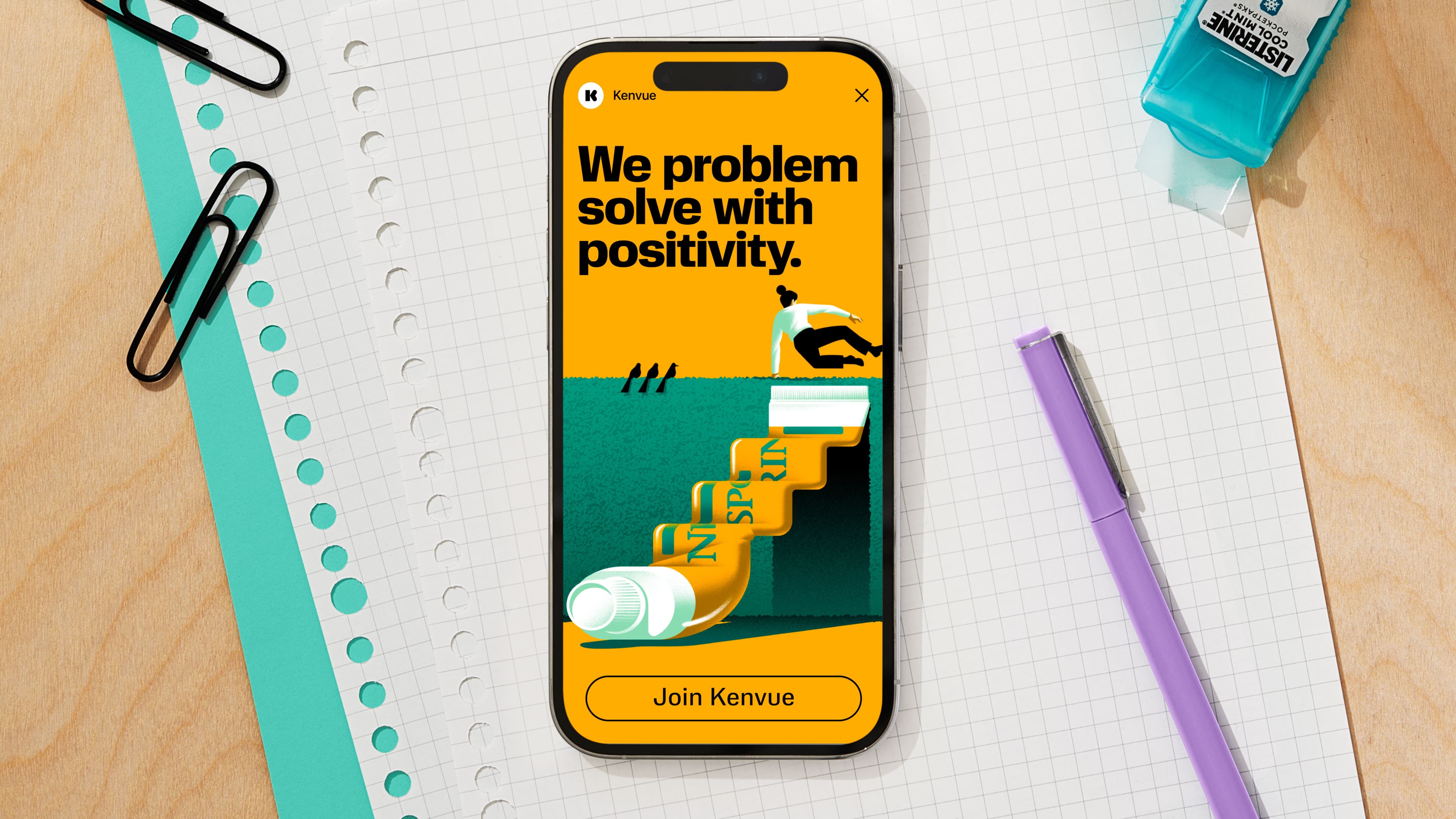
Our 'K' became the cornerstone of a flexible visual system that uplifts and showcases Kenvue’s iconic product brands — heroing the products people know and love in order to further deepen the meaning behind the brand. Kenvue’s new view of care also inspired how we crafted a new brand voice, one that stands out in the category by being more conversational and personal without sacrificing a feeling of expertise and trustworthiness.
Launching a new leader
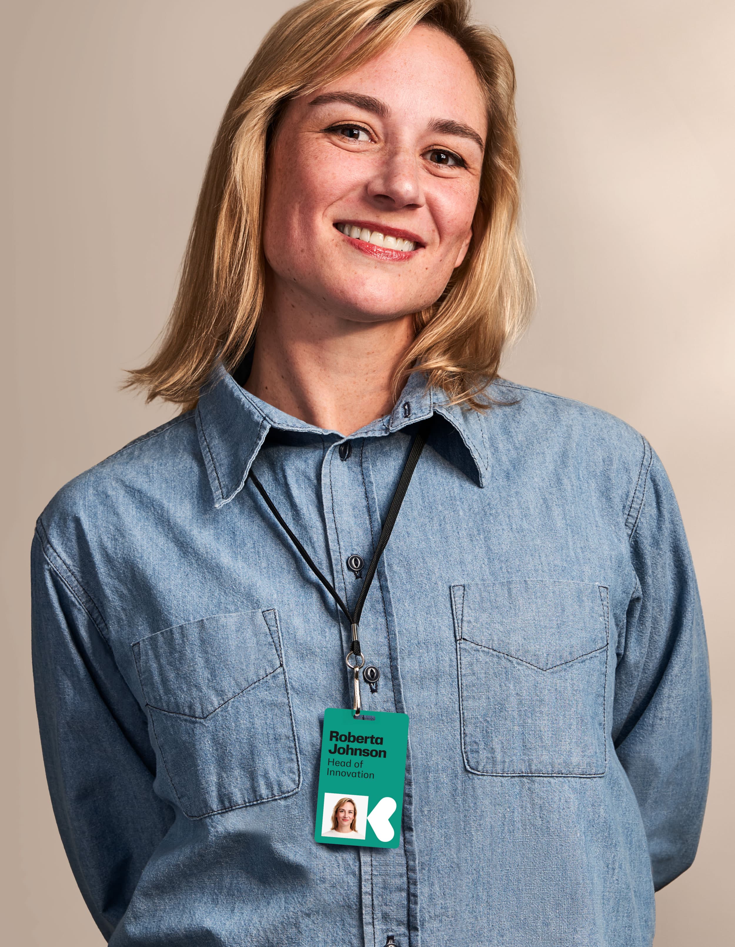
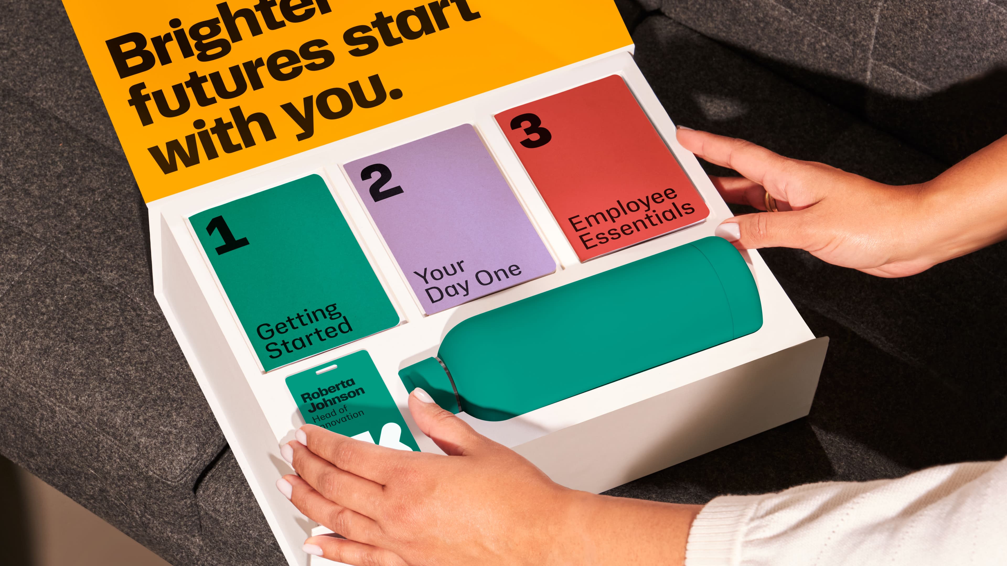
The result was a bold new start for a consumer health leader. The new Kenvue brand is more engaging and relatable than traditional consumer health parent brands. Powered by the new identity, the brand has energised a workforce and become a badge of pride for its employees. And in spring 2023, as the world’s largest pure-play consumer health company, Kenvue made a big splash with its $3.8bn IPO — the biggest since 2021.
Paul Owen, Head of Design at Kenvue said: "It’s not every day that you have an opportunity to create a new to world brand for a multi-billion-dollar business with 100+ years of heritage. This process was complex with many stakeholders, demanding timing and global dependencies. The Wolff Olins team thrives in these kinds of situations and were the guiding light on our journey. Their team’s ability to pivot, iterate nimbly and drive results through ambiguity was brilliant.”
Industry
Consumer goods
What We Did
Verbal Identity, Visual Identity, Brand Strategy, Physical Environments, Digital Experience
1,100+
retail banners



“Wolff Olins has done an incredible job in bringing to life our brand purpose and name, conveying everyday care and scientific expertise in a way that brings forward our iconic brands, inspires our employees and sets us up for a new chapter of growth.”
Ellesha Kirby (Global Head, Skin Health & Beauty and Design at Kenvue)