New York Botanical Garden
Renewing a New York institution
The New York Botanical Garden has been a local treasure since 1891 – yet it’s also a globally significant institution. Visitors knew about the vibrancy of the experience of NYBG as a place, and scientists and researchers knew it as an institution of academic, horticultural, and botanic expertise. With new leadership and a strategic plan that would expand their impact around the world, they needed to refresh their brand to express both the experience and expertise in a way that made all audiences – from their Bronx community to a global public who care about plants, fungi and the planet – want to come to NYBG and care about their work. Over three seasons at the Garden, we worked closely with them to reimagine their brand in a way that captures the passion of their people and the vibrancy of nature itself. Our work positions them to be known for the organisation of action they are, a place of beauty and contemplation as well as a global leader on environmental action and plant science.
Do right by nature
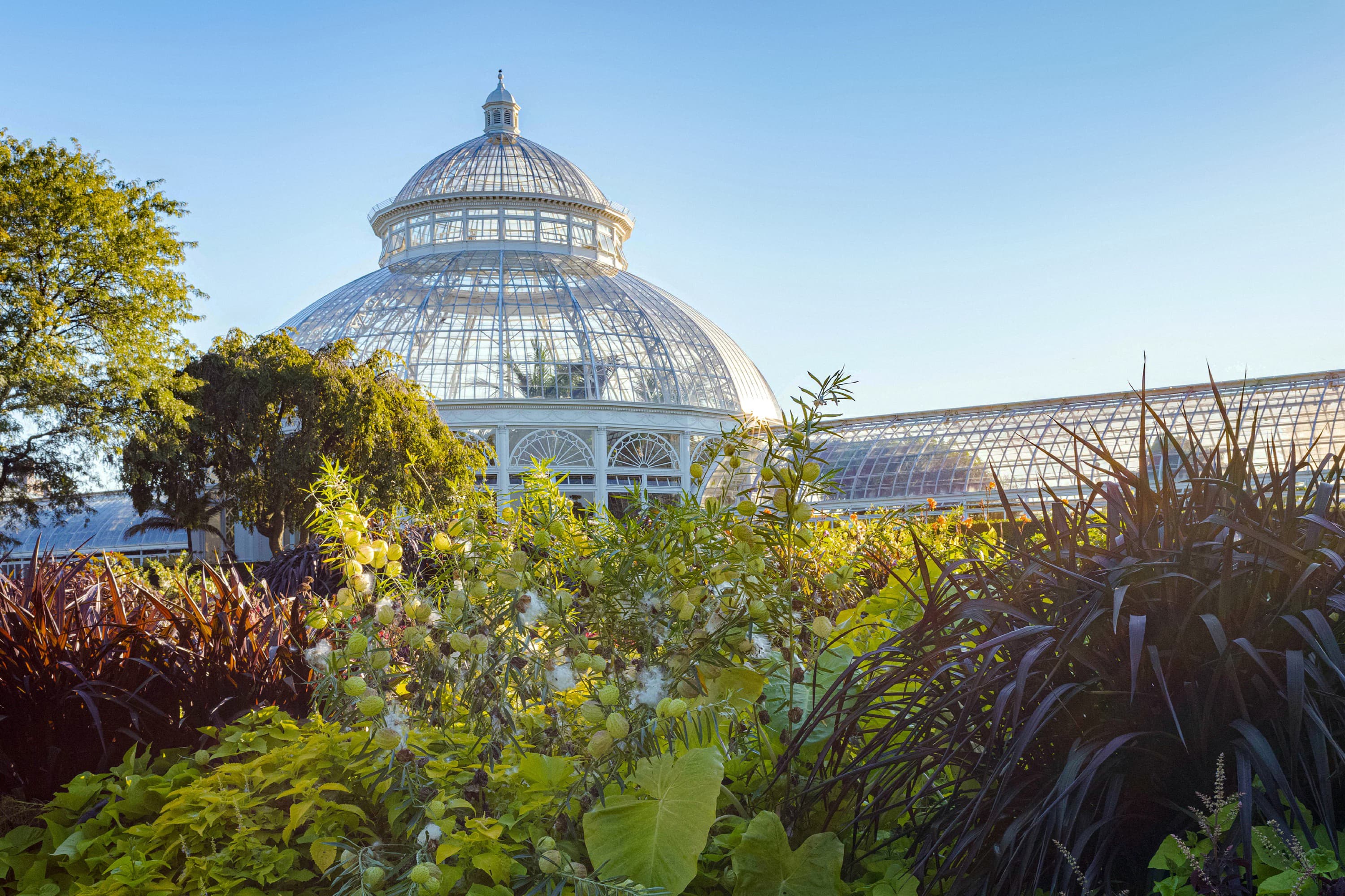
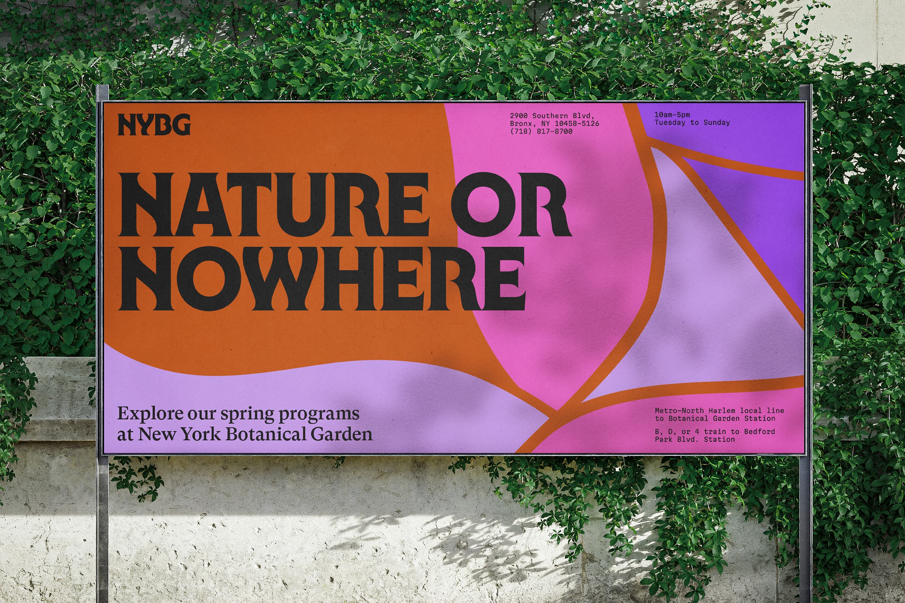
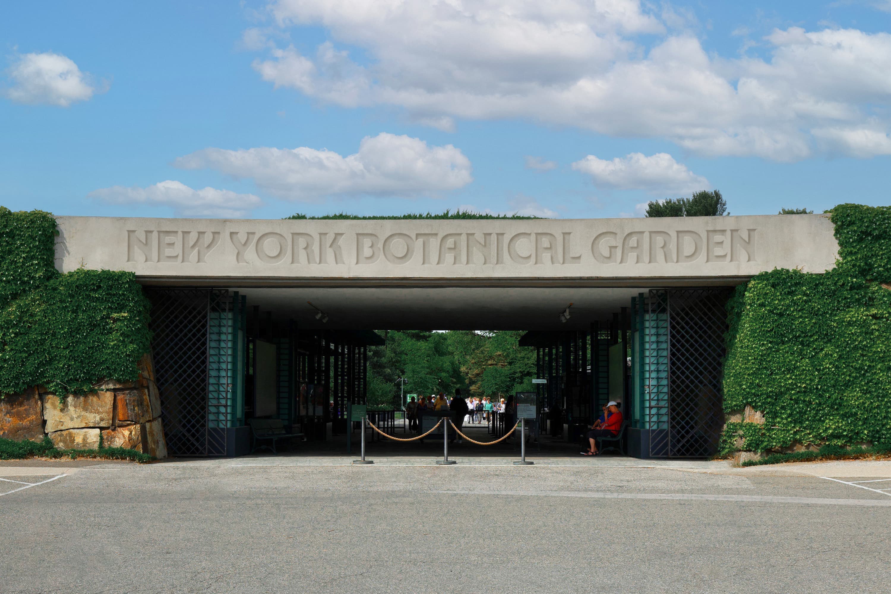
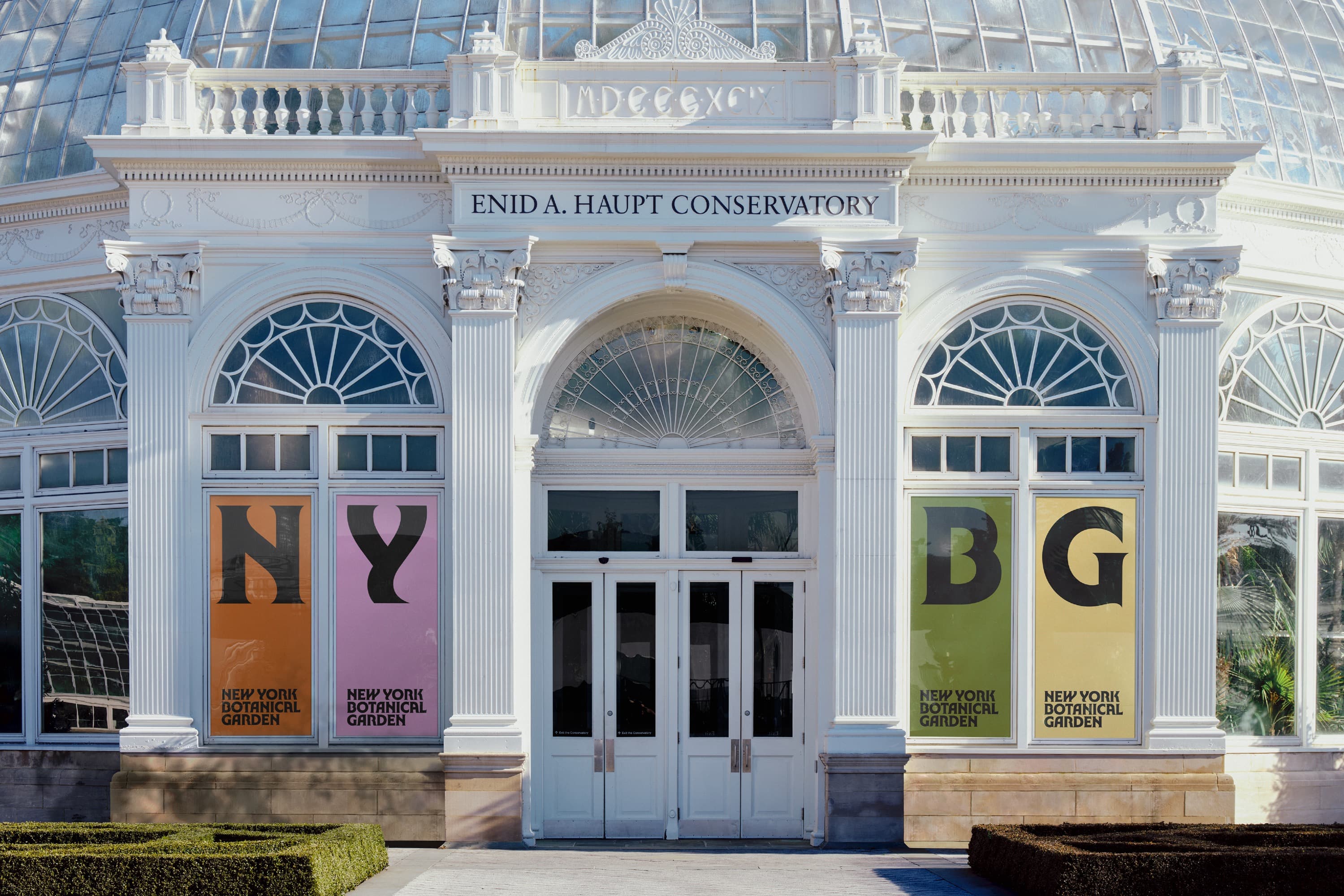
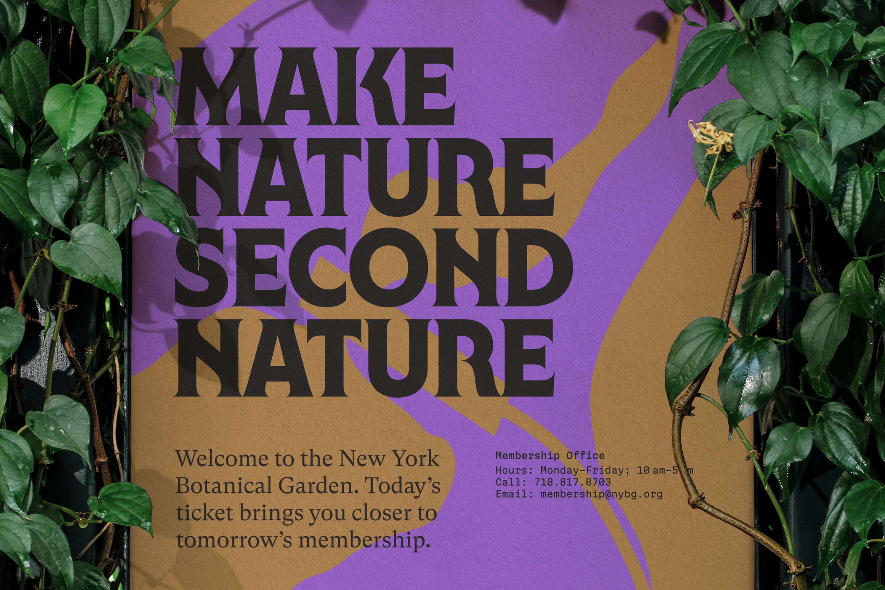
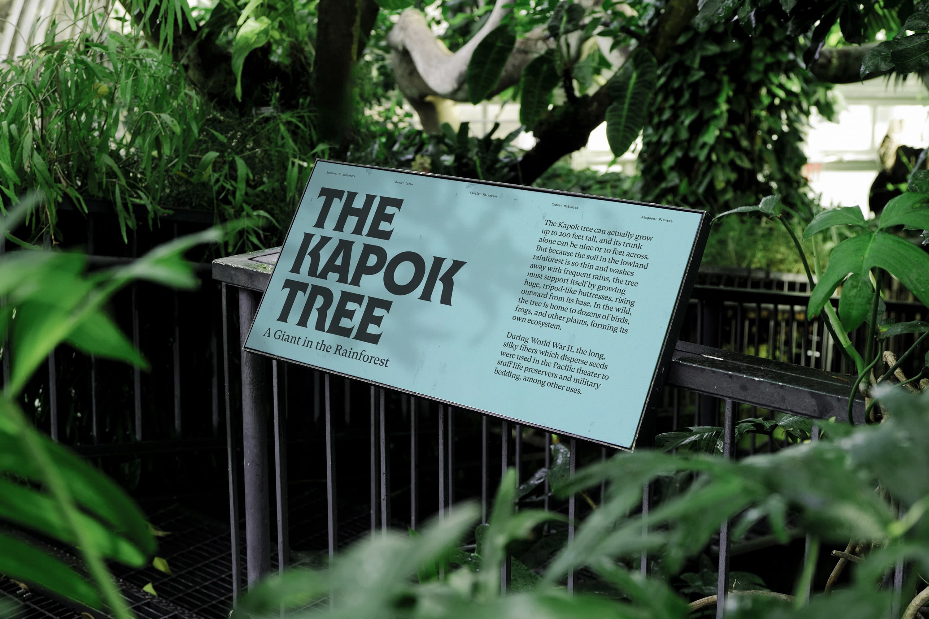
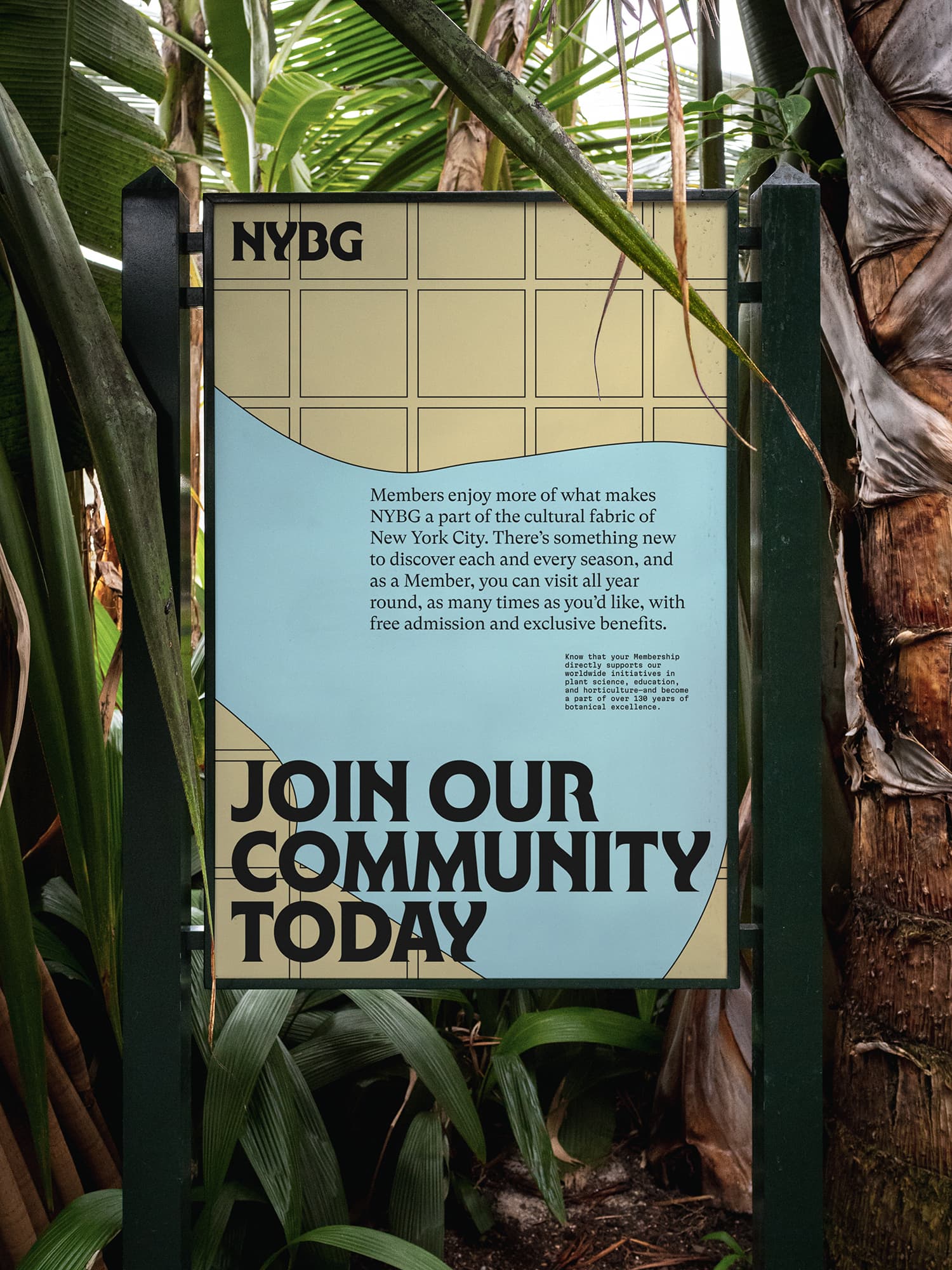
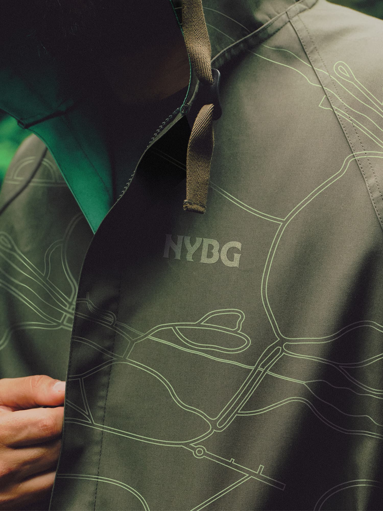
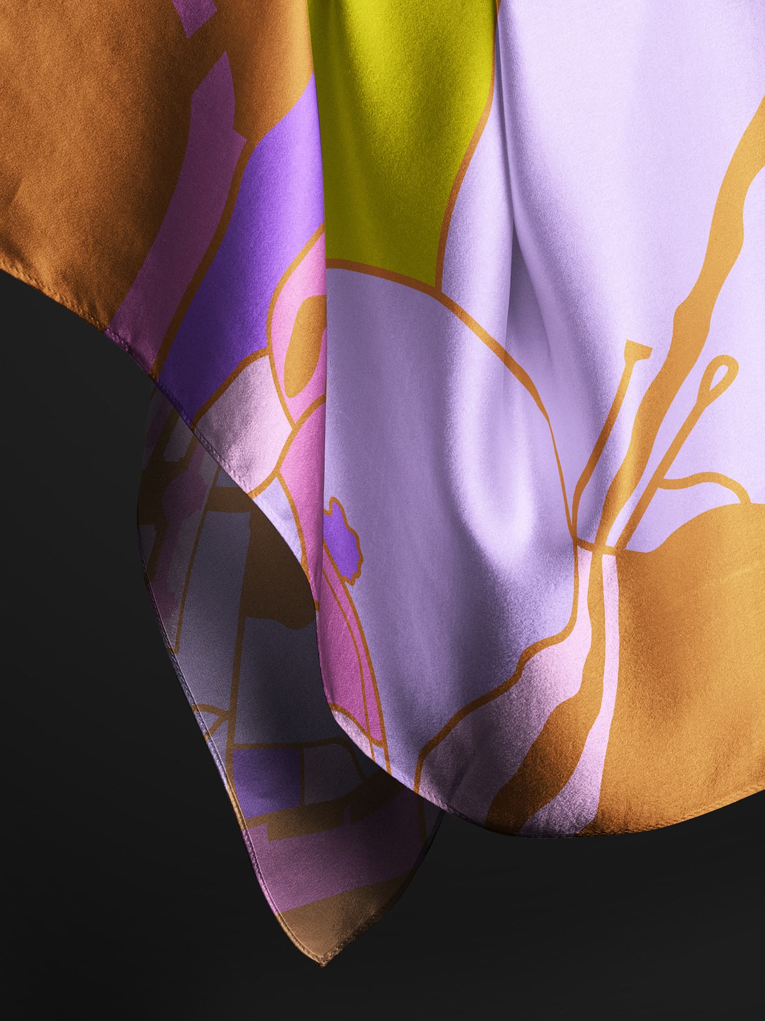
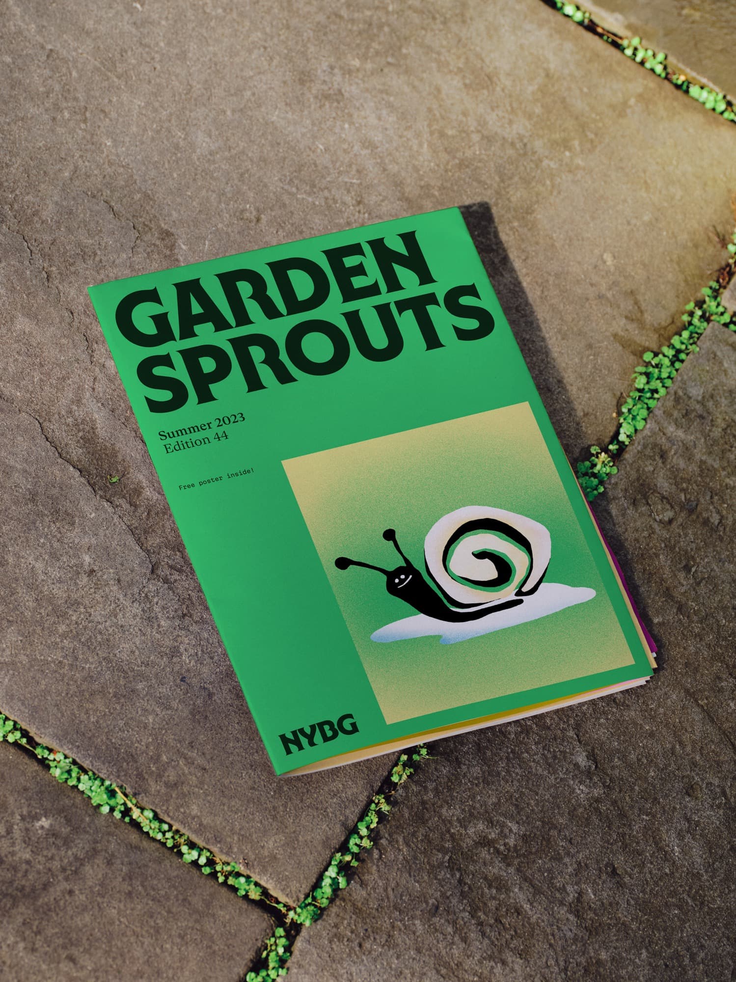
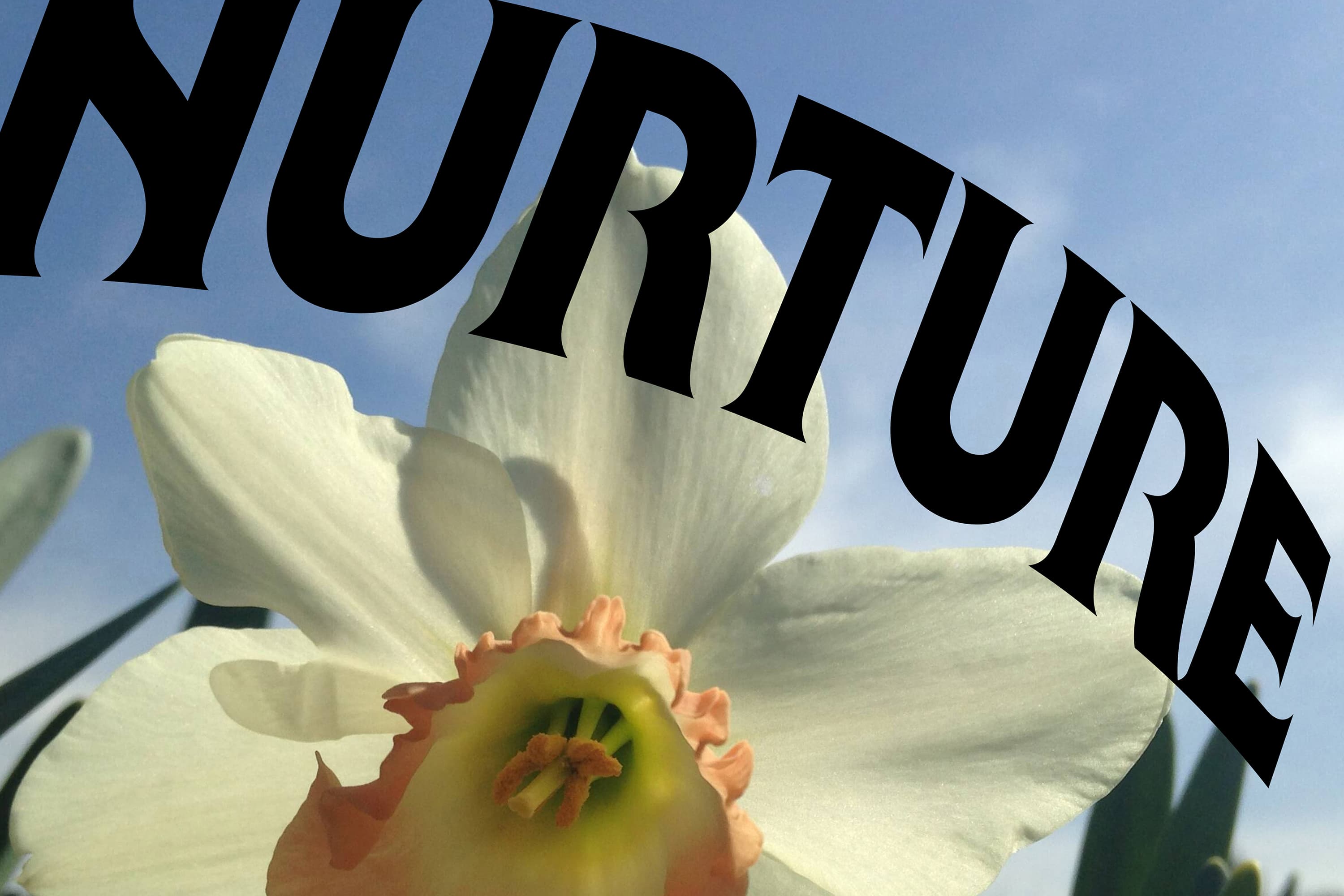
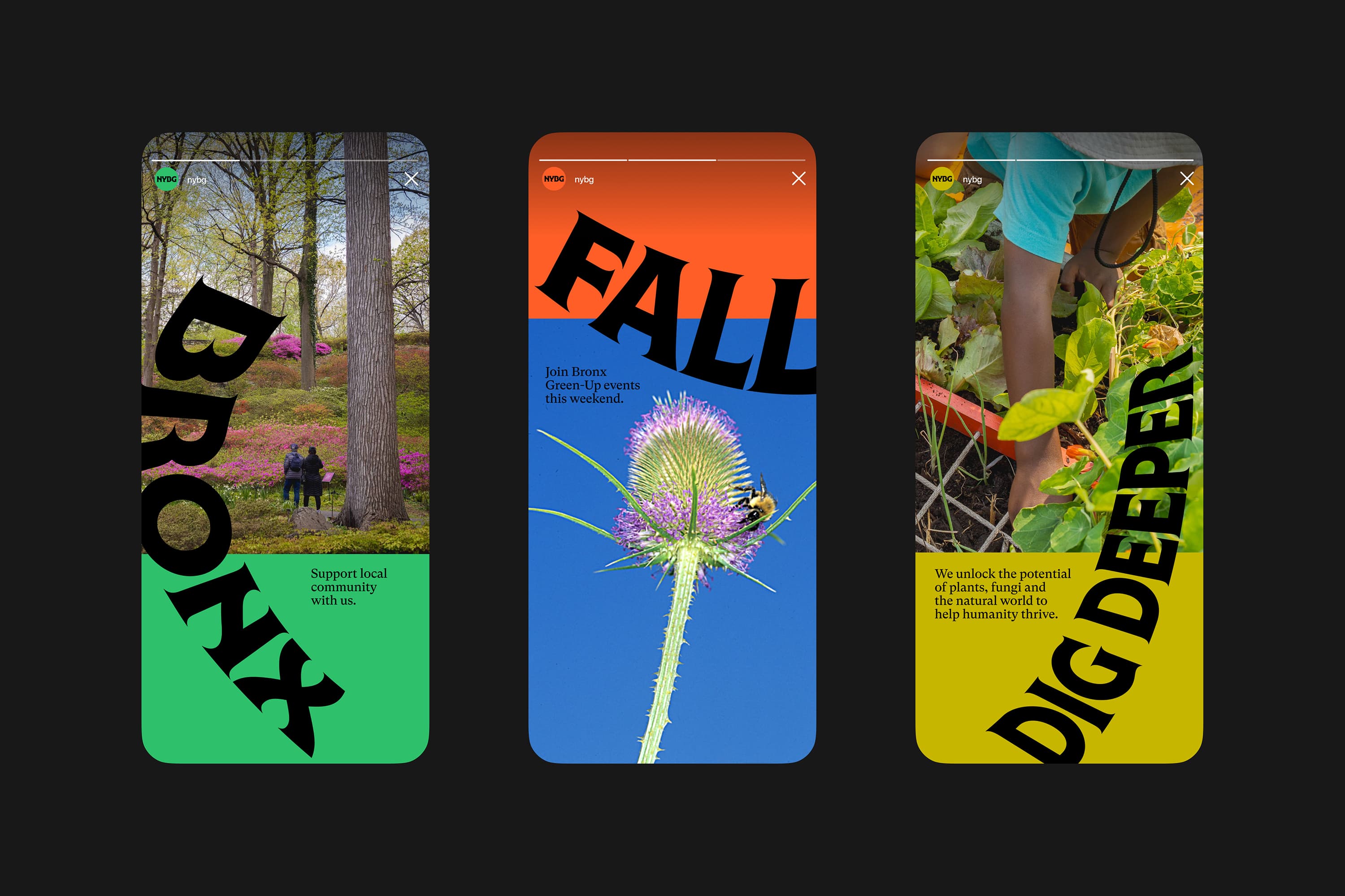
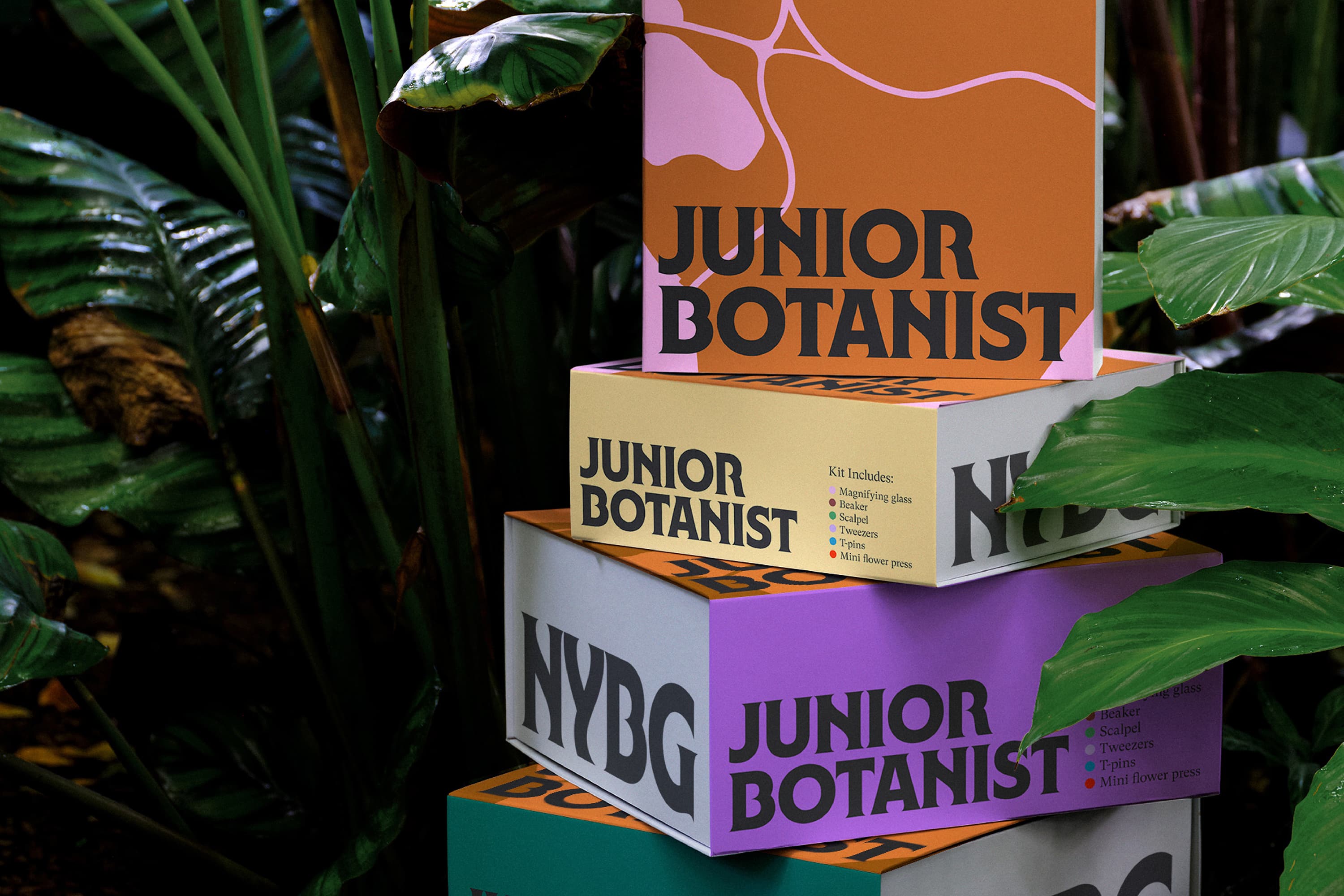
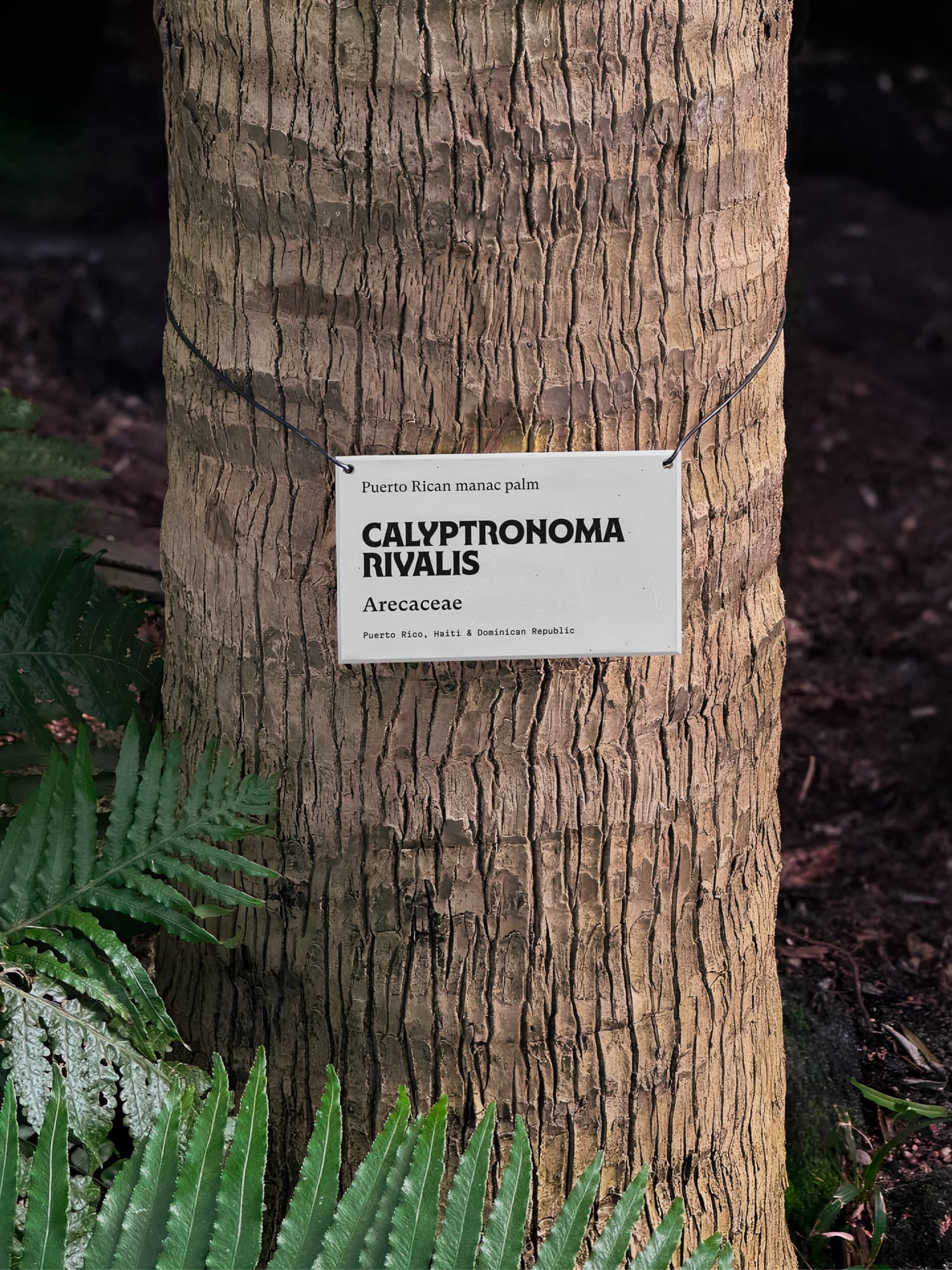
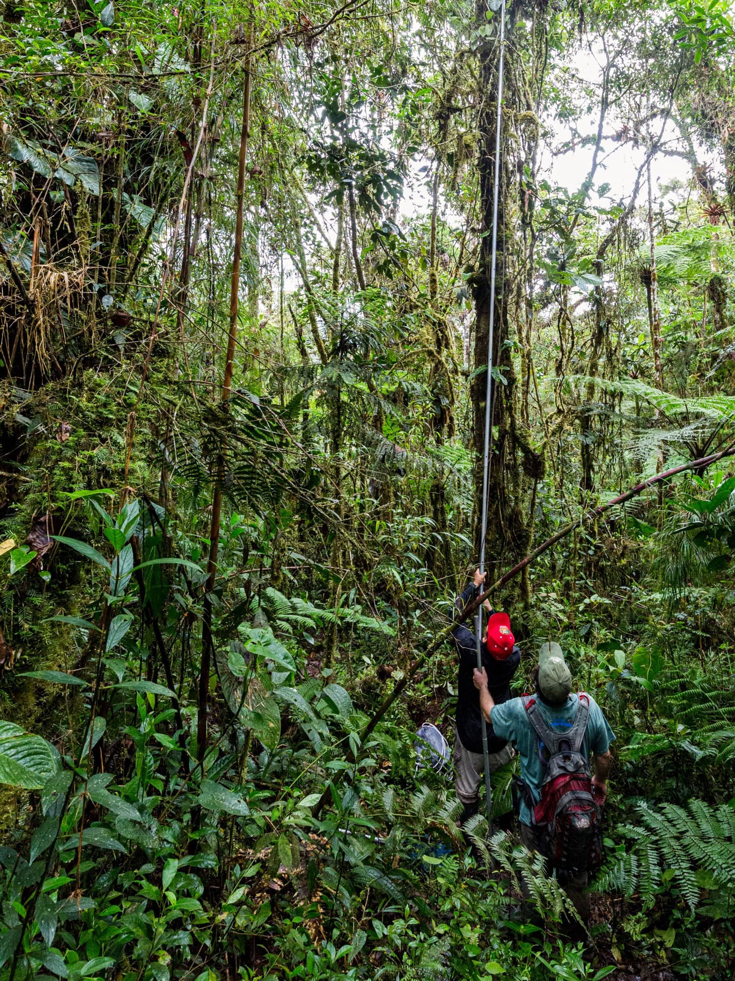
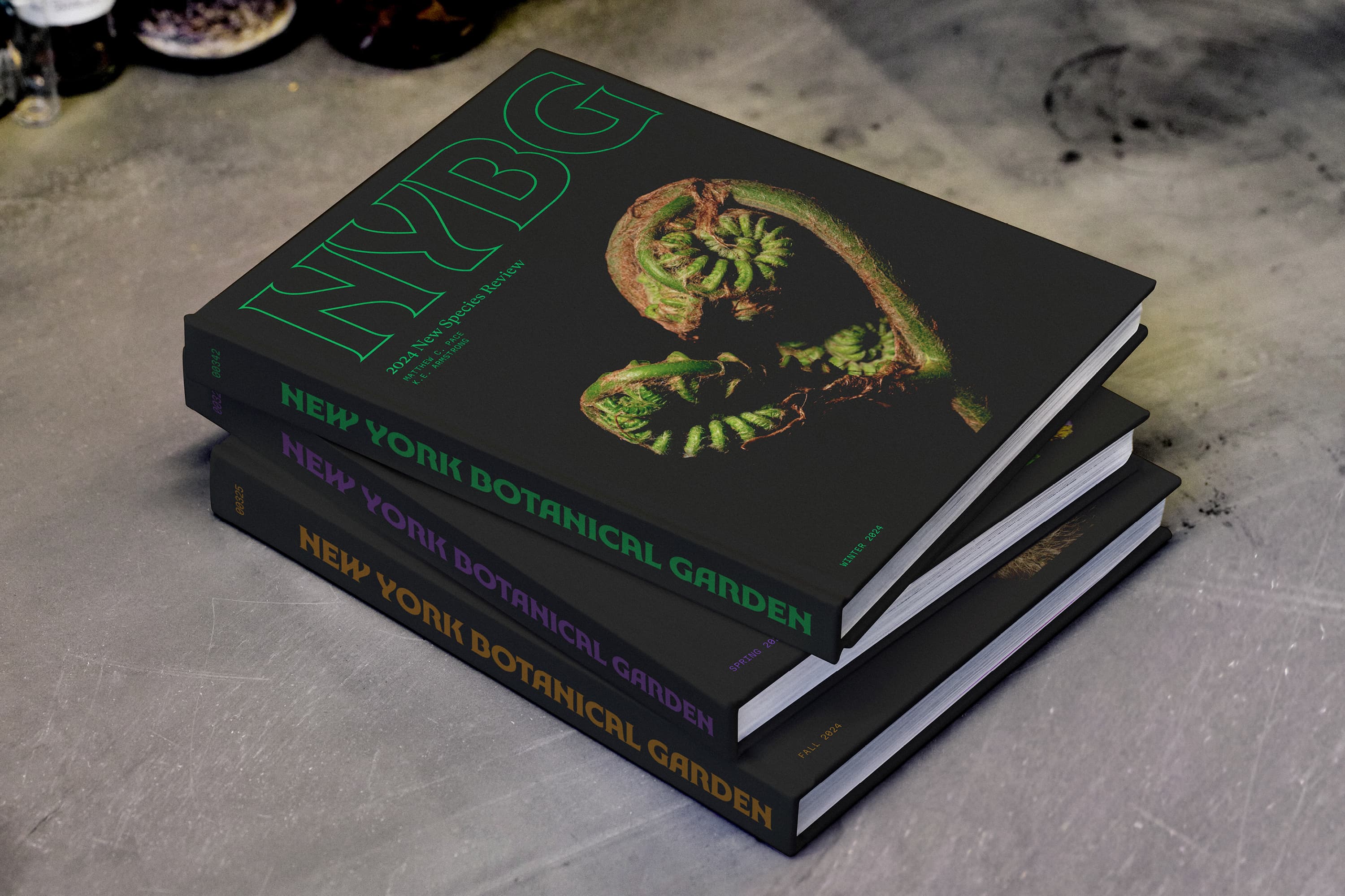
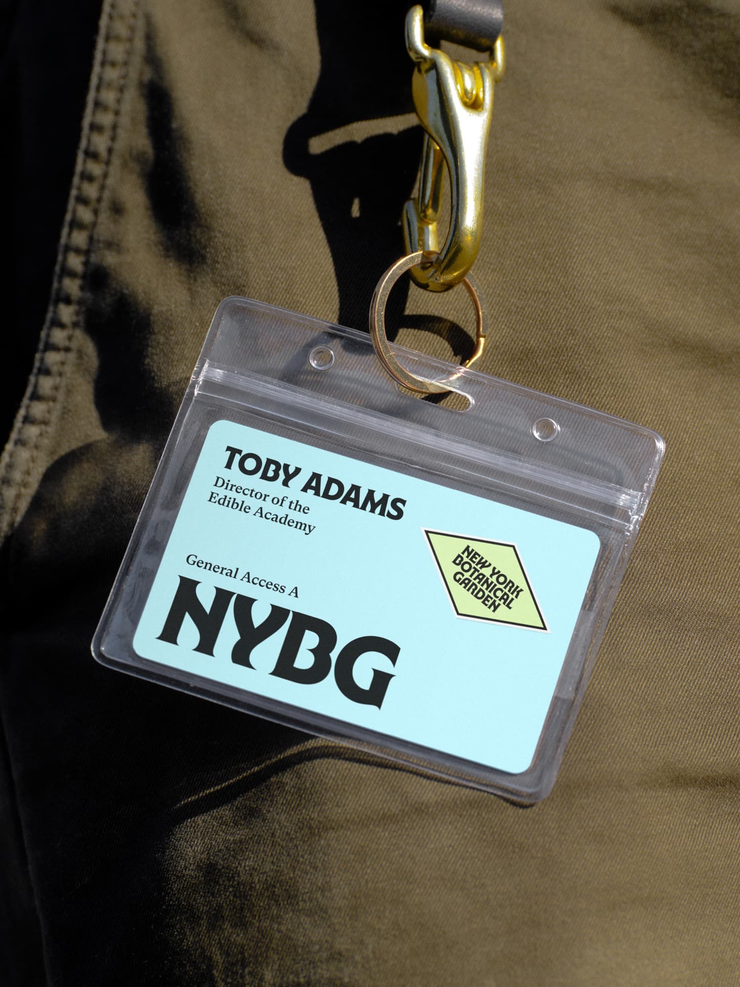
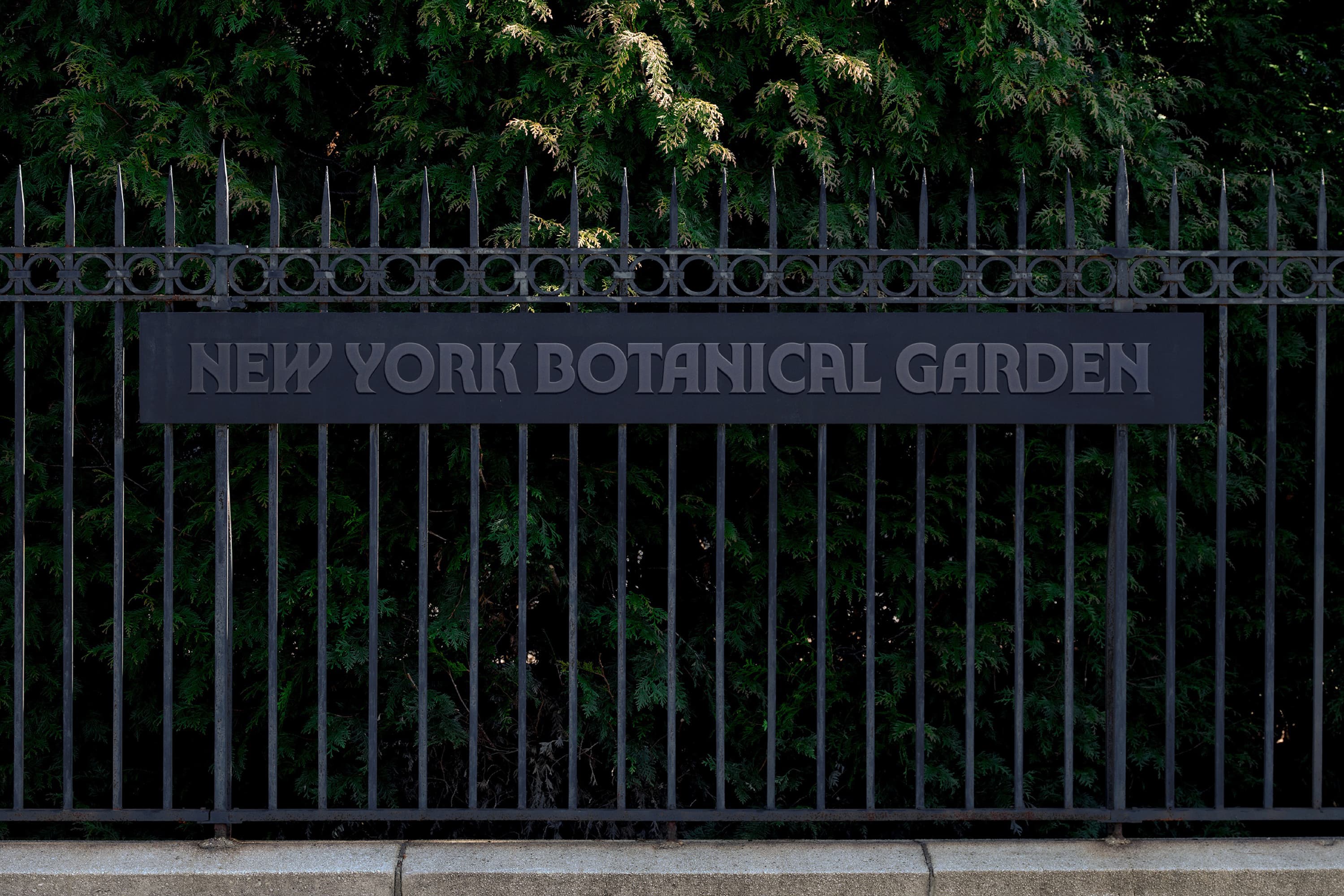
This was the core idea we created for the brand, underscoring the active role of nature while helping to set NYBG as a leader. Doing right by nature can mean different things to all the audiences of NYBG: studying it, protecting it, learning from it, or simply enjoying it. We rooted the entire strategy and identity in the spirit of this call to action, creating a system that balances Bronx boldness and organic lushness with the flexibility to feel fresh year-round. The logo’s custom typography references forms found in nature and evokes a confidence that speaks to the organisation’s impact. The brand voice captures their plant passion and expertise, while inviting people in with the warm directness of a New Yorker. The colour palette is inspired by the NYBG landscape, from trees to fungi to the Bronx River, and meant to be combined in endless, unexpected ways year-round. A sense of place, natural and active with a New York attitude, comes across in every element of the system: a photography style that evokes seeing from nature’s perspective; a graphic language derived from the forms of the Garden; and a grid echoing the glass panes of the iconic Enid A. Haupt Conservatory.
A brand for all seasons
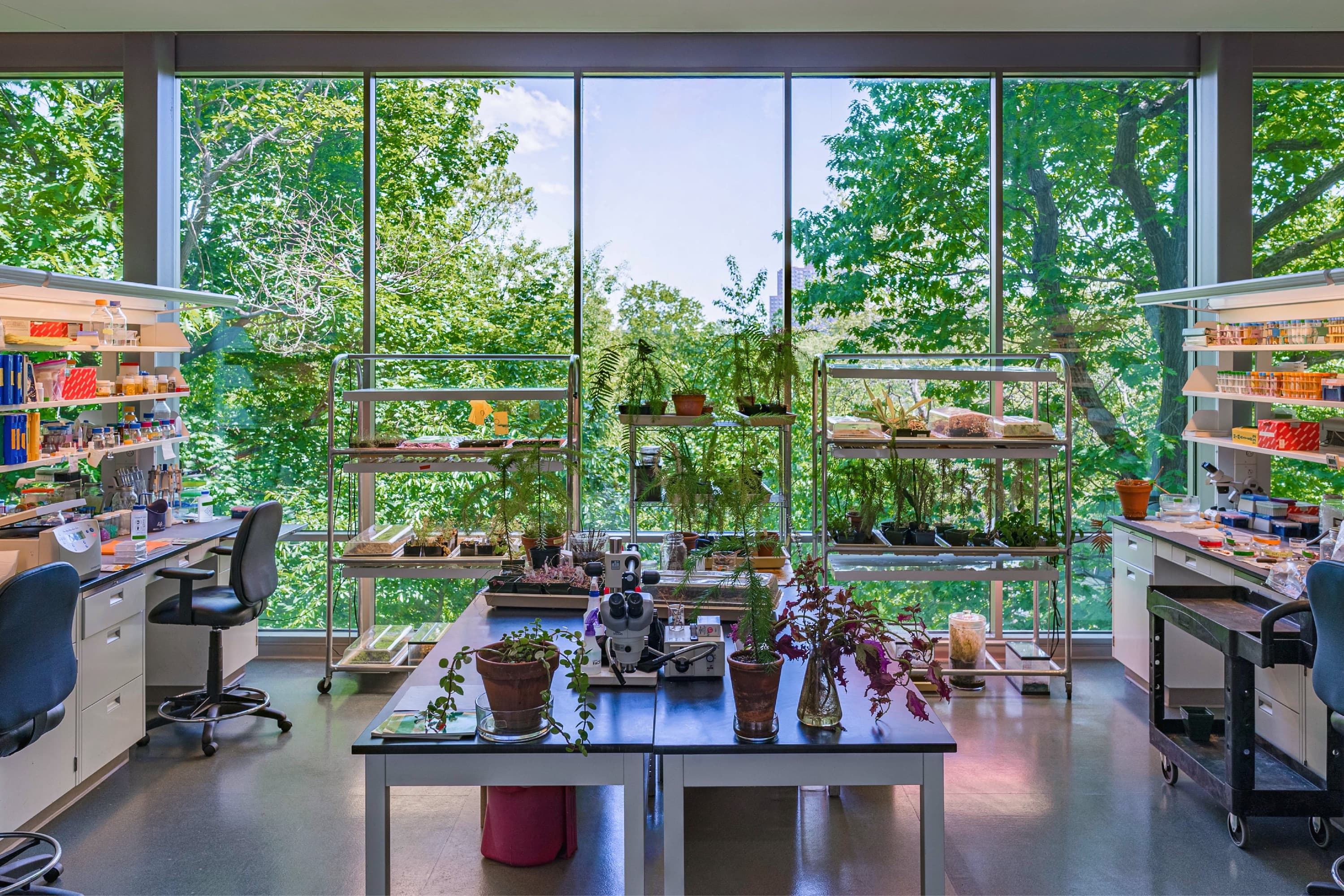
The brand’s embodiment of all these facets of NYBG couldn’t have happened without us working closely with the people of NYBG and spending a lot of time at the Garden. We toured the grounds, labs, libraries, Herbarium, and greenhouses, did volunteer gardening, and talked to their team – horticulturalists, administrators, and educators. We pushed them, and they pushed us – as we took on the weight of a beloved institution, we kept in mind the need to create something iconic, long-lasting, and expressive. This was an exercise in focusing them among many audiences and getting down to the essence: an idea big enough to hold everything they stand for. Along with a truly usable identity, we’ve created tools to take them forward through operational and functional shifts. And above all, we’ve tried to position them to have greater relevance on a global scale, opening the way for exciting new partnerships and collaborations to bring everyone a little closer to the Garden, even if they’re nowhere near the northernmost borough. Since launching in January 2024, our collaboration with NYBG has picked up awards at The Type Directors Club, The One Show and D&AD.
Industry
Culture and education
What We Did
Visual Identity, Verbal Identity, Brand Strategy







“Wolff Olins has helped the entire team here at NYBG more clearly articulate our vision for the future, and in turn will allow the institution to more effectively reach a broader and more diverse range of Visitors and Learners, both on-site and online. The new identity system cements NYBG as an active, bold, and welcoming presence that will connect and inspire, ensuring that current and future generations of Garden-goers feel connected to nature – because we can’t imagine a life without that feeling.”
Michael Crowley, Chief Marketing Officer, NYBG