Decathlon
Rewriting sport's playbook for billions of athletes
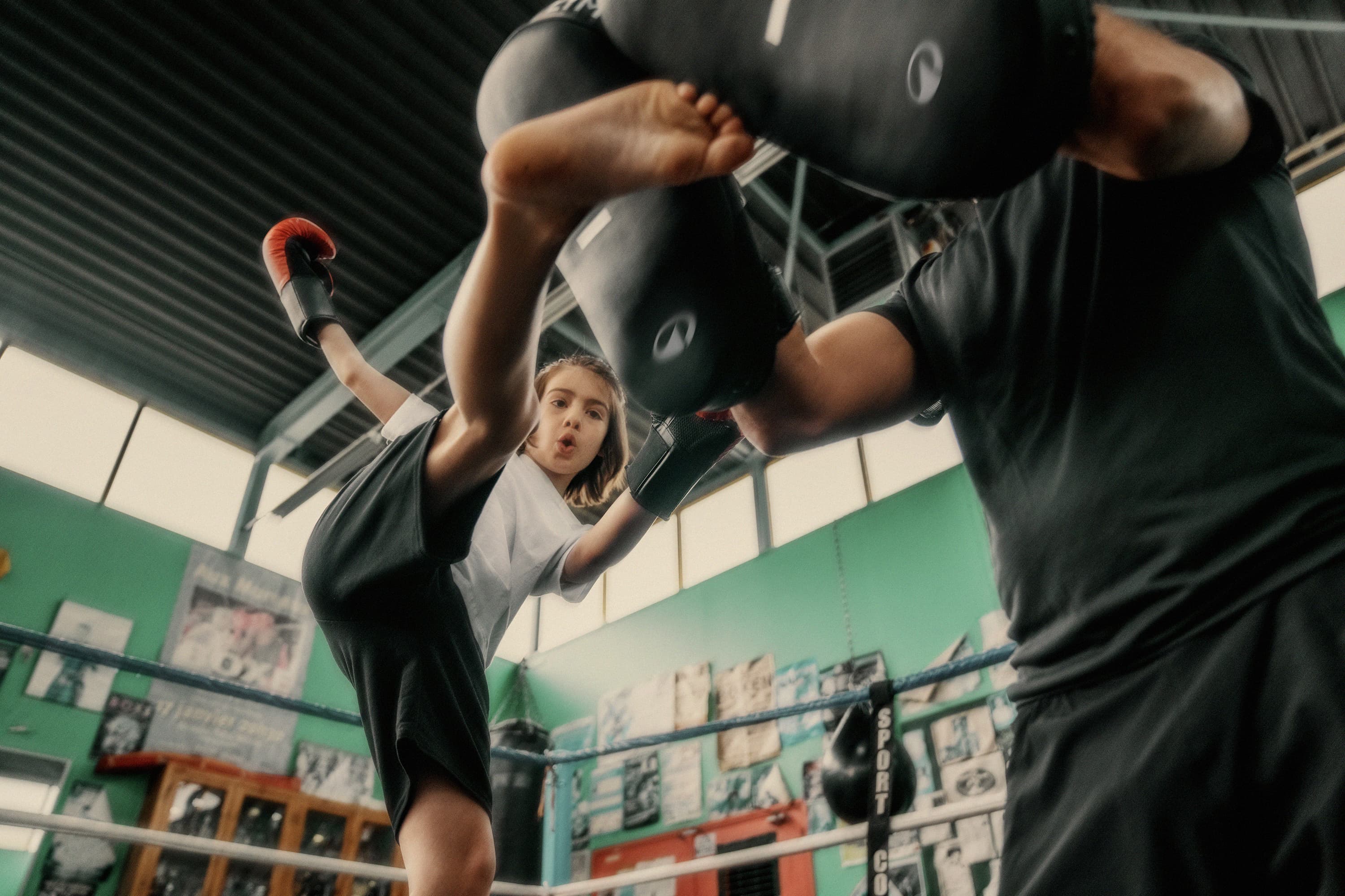
Over 3 billion people participate in sports and physical activity around the world; people from all ages, abilities, backgrounds, levels and motivations. But sport’s narrative – gripped by a handful of brands – too often focuses on stories of greatness, glory and perfection.
Decathlon is the 3rd biggest sports company in the world, with a revenue of over $15bn and 2000 stores worldwide. It designs for all sports, all people and all levels. Since its creation in 1976, Decathlon believes sport should be inclusive; catering to pros and beginners alike. But despite its scale, Decathlon's cultural impact in sport was faint and it was losing out on younger audiences.
We worked to transform its retailer brand into a global sports brand that could adapt across 70 markets, 85 sports, 4 practice levels and on/offline touchpoints.
The wonders of sport
A simple question sat at the heart of our approach: what role does sport play in our lives?
From playgrounds to podiums, we heard the same thing: when people stop enjoying sport, they stop playing it. Research revealed that people's love for sport is not rooted in winning but in the enjoyment and wellness it brings.
This major insight, combined with Decathlon’s proud legacy of accessibility, led to the development of our brand strategy which is anchored around the idea of wonder. Wonder is the promise of amplifying all the emotions of sport: enjoyment, connection, adventure, the ups, the downs and everything in between. It’s an invitation for people to play their ways, on their terms.
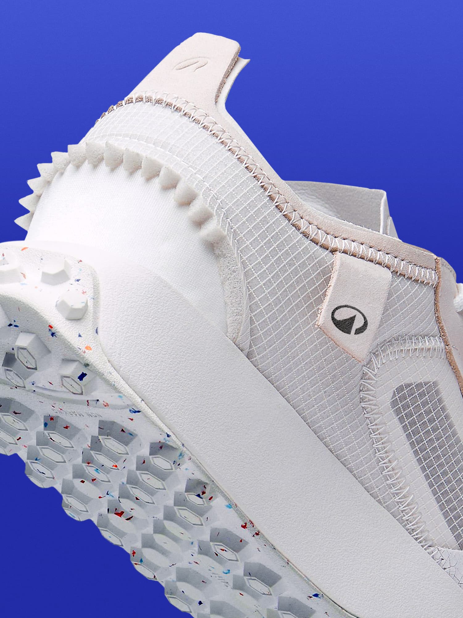
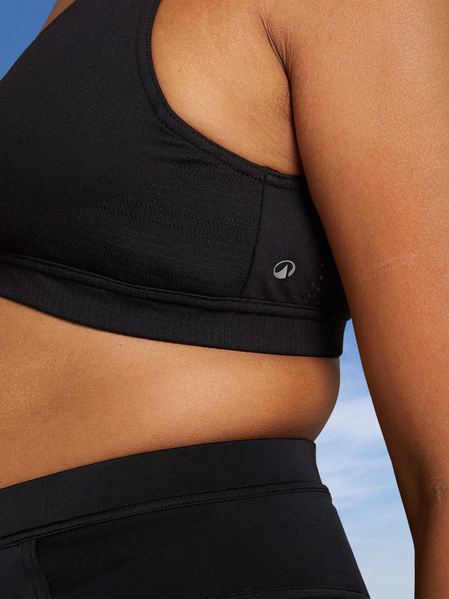
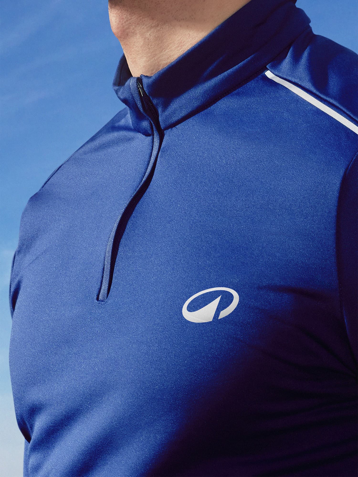
Alongside refreshing the iconic blue and refining its unique wordmark, we introduced a new symbol, L’Orbit, to reflect the new North Star: ‘move people through the wonders of sport.’ The symbol conveys movement and circularity, with a strong angle inspired by the iconic wordmark and a peak representing its connection to outdoor sporting activities. It will now feature prominently on all products, from play to pro, signalling a new narrative for sport, celebrating movement, participation and progress.
A story and system fit for a global sports brand
A portfolio of 85 brands were streamlined into one unified brand: Decathlon. We developed a new voice, art direction, motion, iconography, as well as introducing a bespoke typeface, Decathlon Sans. Designed by Grilli Type, it’s a clean grotesque typeface designed to make an impact, by offering intentional disruptions with a set of alternate characters that infuse it with movement and dynamism.
We also reinforced Decathlon’s innovation and sustainability credentials by integrating design elements, such as iconography and colours, that highlight product features and services which benefit both the customer and the planet.
Transforming a brand of this scale and ambition, with such deep cultural attachments (the brand is regularly voted people’s favourite brand in its traditional markets) was no mean feat. Throughout the project, we partnered closely with Decathlon’s CEO and business stakeholders to ensure the transformation was as collaborative and impactful as possible - starting internally with hundreds of thousands of Decathlon employees before officially launching to its global audiences.
External credits: FourOneNine, Photography / Jamie Mourn, Photography / Studio PIC, 3D Rendering / Peek Content, Research / Grilli Type, Typeface / Work & Co, Website / Father, Sonic / Alistair McCready, Wordmark /
Industry
Sports
What We Did
Brand Strategy, Brand Architecture, Visual Identity, Verbal Identity, Research, Physical Environments

“Wolff Olins don’t just turn up to play the game. They change the game.”
Barbara Martin Coppola, CEO, Decathlon
