Uber
From app to mobility company
We’ve partnered with Uber on projects spanning across brand, culture, and experience since 2017, joining its journey from ride-hailing app to mobility platform to travel powerhouse.
The cost of hypergrowth
Seven years after Uber’s 2010 maiden voyage across San Francisco, Uber was operating in 500 cities and booking five billion rides – an already staggering number that would double within another year.
But the culture that made this hypergrowth possible was unsustainable. When Dara Khosrowshahi joined as CEO in 2017, he initiated a programme of transformation to combat the internal and external pressures of the company’s accelerated growth.
Moving the brand in the right direction
We began working with Uber on a series of projects to turn the brand around. These were grounded in the company’s culture, but expanded into brand architecture, new offers, campaigns and a whole new brand identity – all in service of its transformation from app to mobility company.
Industry
Travel and hospitality
What We Did
Brand Strategy, Brand Architecture, Visual Identity, Verbal Identity, Research, Employer Brand, Culture Strategy & EVP, Physical Environments, Digital Experience
51%
increase in brand value ahead of their initial IPO
Brand Value
Many of the challenges that surfaced in 2017 and 2018 were the result of the aggressive culture that made hypergrowth possible. Across multiple projects, a central theme to our partnership was to address the unmet needs of the people at the heart of the brand – drivers, employees and riders.
In Latin America, the first region to achieve profit, growth was threatened by a vicious cycle of low driver retention. We partnered with Uber LATAM leadership to set a new cultural mindset and platform to improve retention and ultimately regain trust with riders as well.
We then worked with the People and Brand organisations to develop a new global employee value proposition “Go Far and Fast Together” to help rebuild pride in being an Uber employee. We activated the EVP with campaigns and internal events.
The EVP was complemented with a refreshed compliance and ethics approach to help increase employee trust, transparency and accountability. Working with Chief Legal Officer Tony West, our Stand-Up, Speak-Up initiative helped define an approach for Uber employees to act like owners when they see something that isn’t right.
For riders, safety was top of mind. We created the “safety blue” colour as a central focus for the brand and identity system, to signal the change and serve as a constant reminder of Uber's renewed commitment to safety.
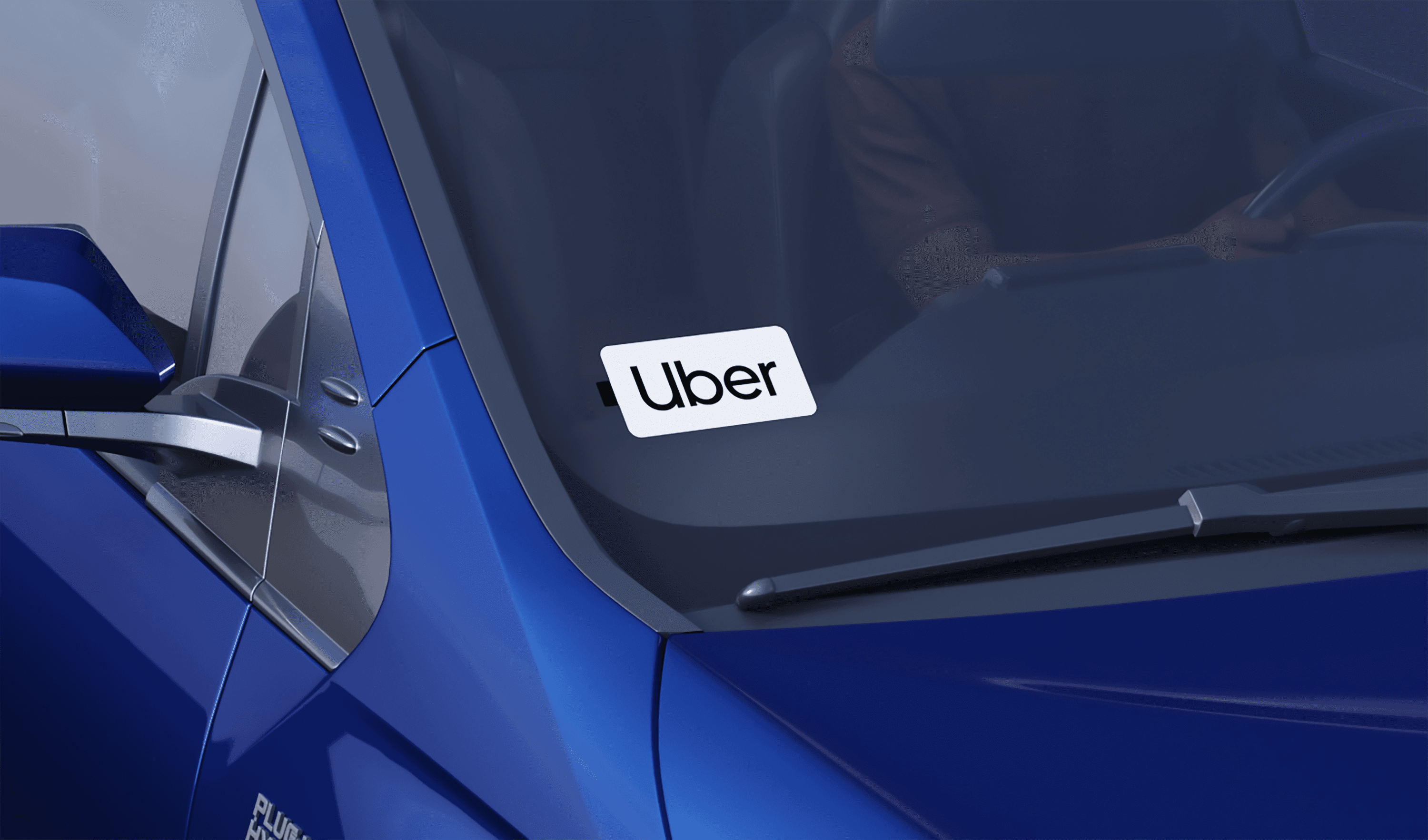
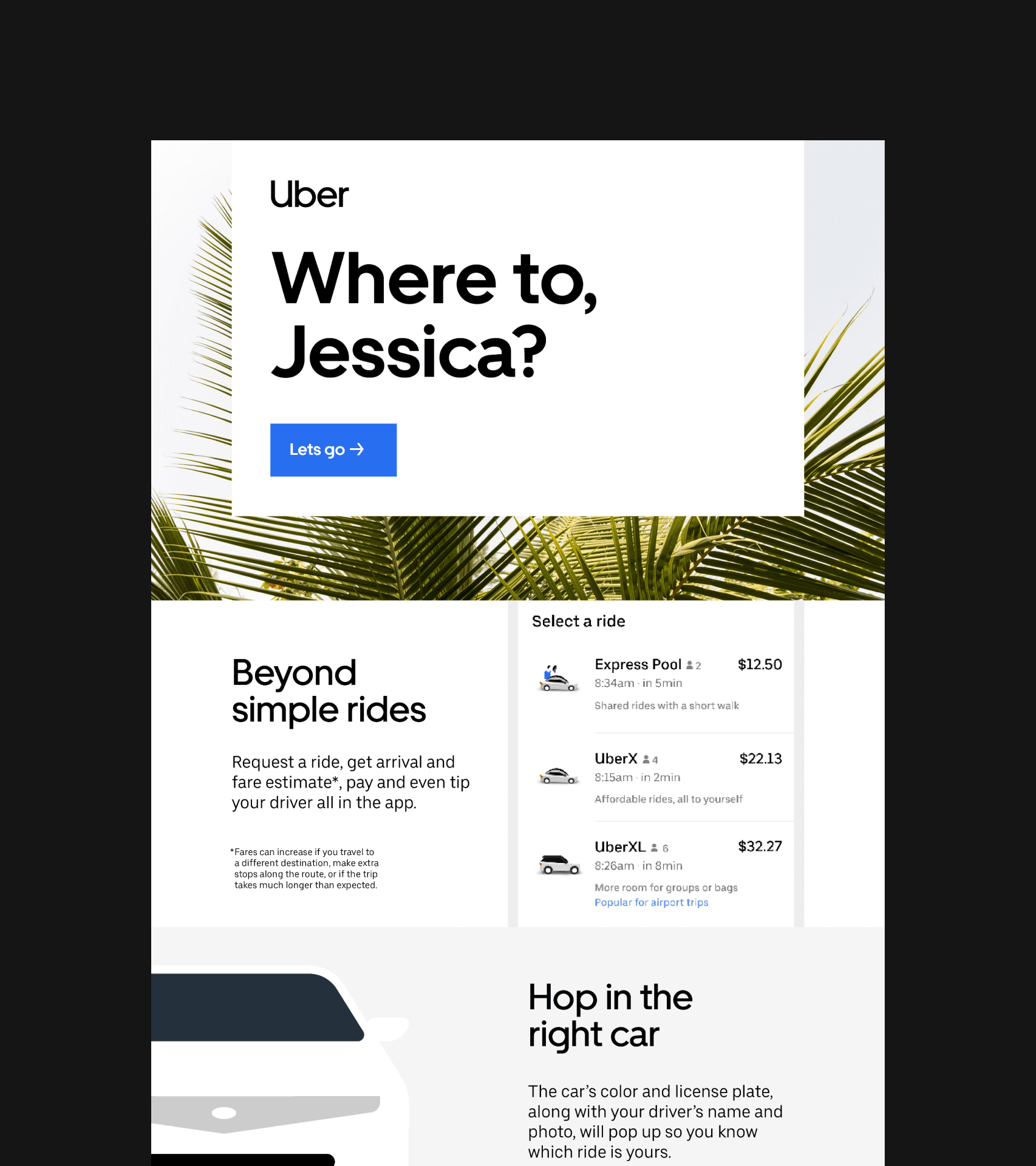
These cultural shifts supported a changing emphasis in the business as a whole; from scale to service. We helped to shape a new brand narrative around the changes that Dara Khosrowshahi and his team were enacting, based on how “movement ignites opportunity”.
First, we crafted a simplified brand architecture to streamline the business portfolio in preparation for the 2019 IPO. We’ve pushed this simplification further uniting everything under “Go-Get”. This concept was designed to clarify Uber’s offer via different mobility needs, providing ways for people to go and get things at their convenience. The “Go-Get” strategy was launched post-COVID 19. Both versions of the architecture presented Uber as a tech platform or “mobility ecosystem”, supporting the IPO investor story.
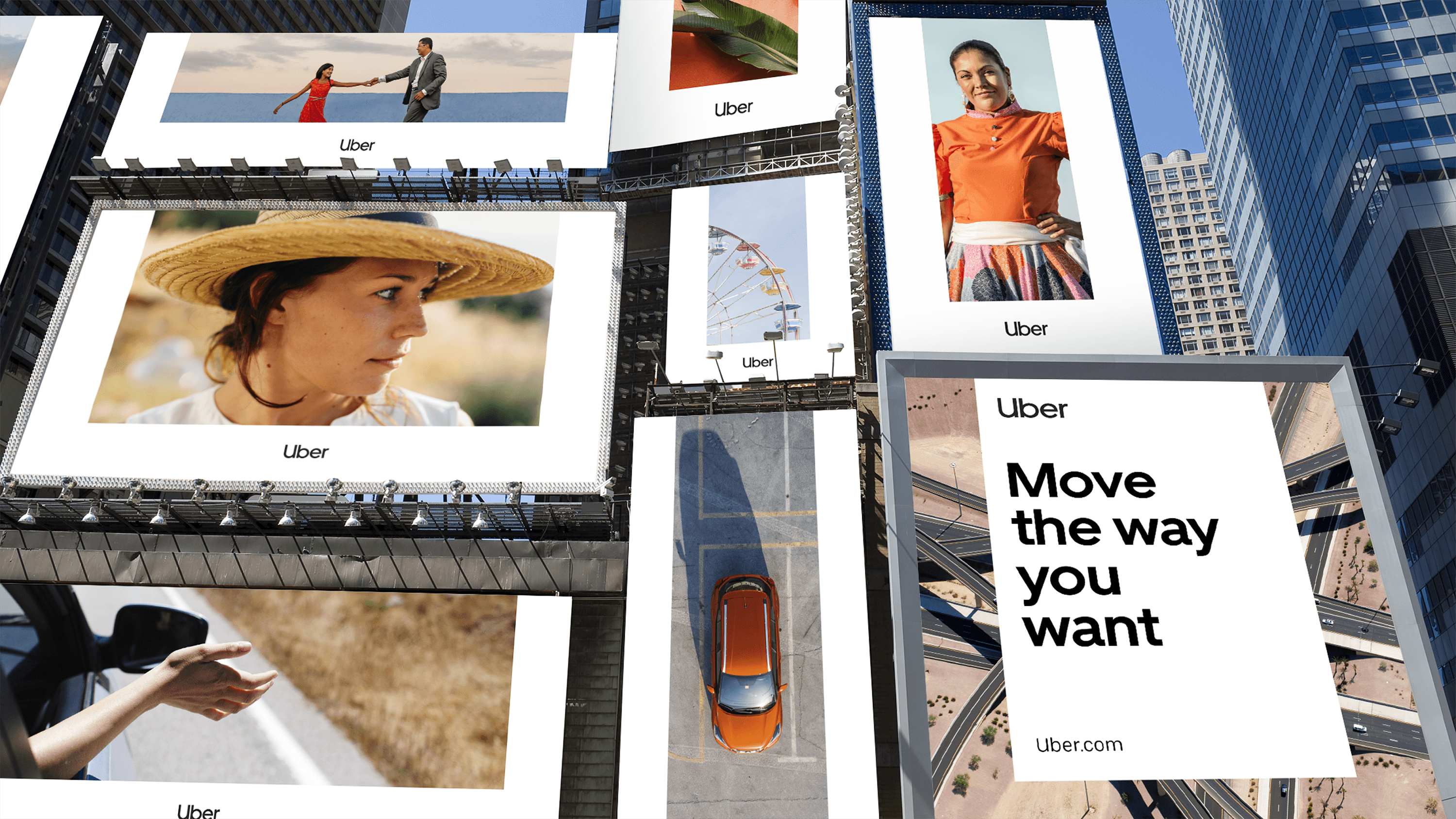
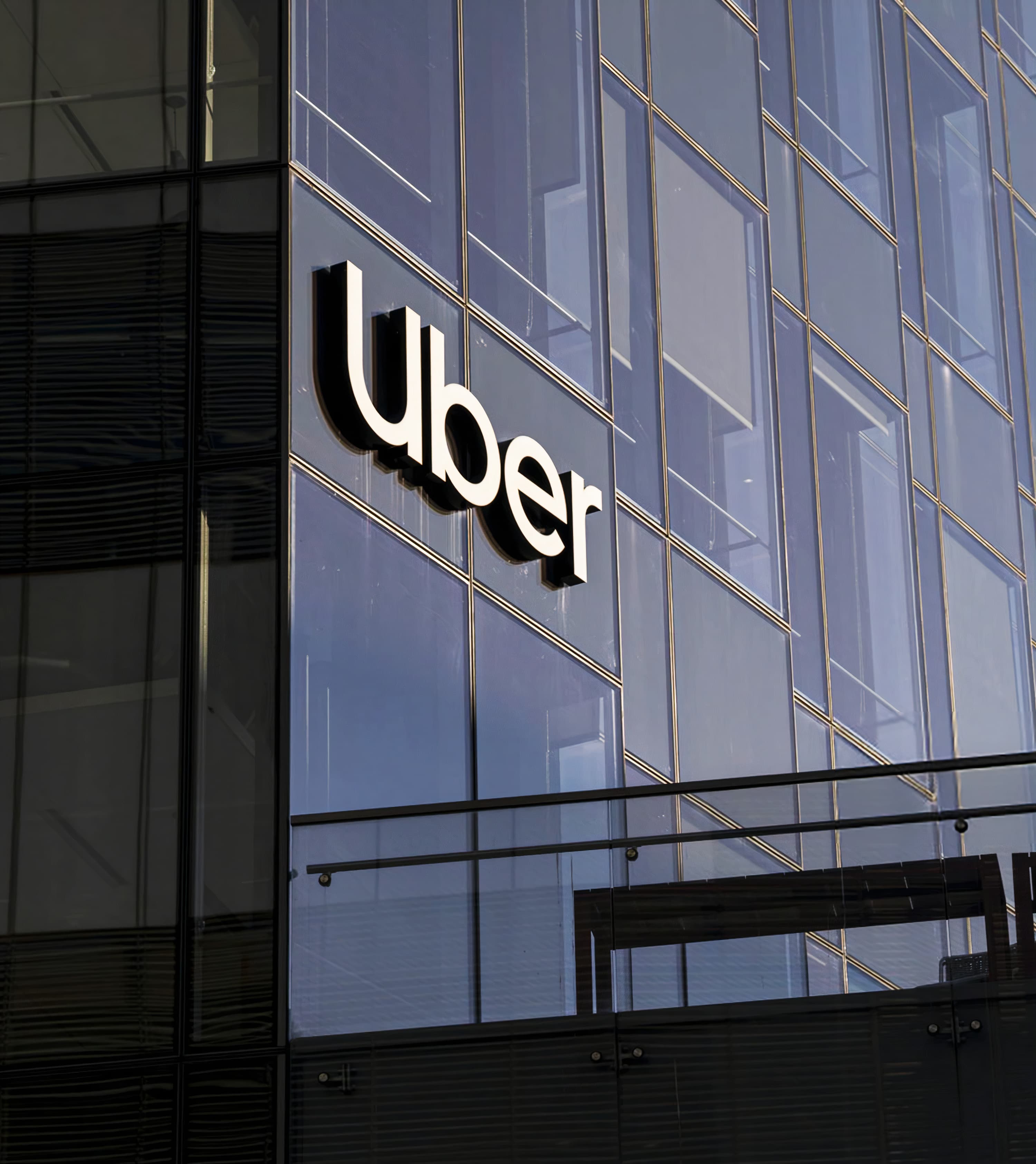
We also carried out a global audit and immersion, speaking with 200+ stakeholders, 11 functional teams, and five global territories to identify where the opportunity was for a refreshed global design system. This allowed us to create a design language that flexes across the “mobility ecosystem” and puts people first, ensuring consistency across the globe while supporting localisation.
What made the 2019 launch and subsequent roll-out a huge success was the intensive time we spent with teams across regions to showcase, educate and interact as they tested and evolved the system for their own communications priorities and initiatives.
In the years since 2010, Uber had already been expanding vastly from its original mode of travel and black limos into dozens of services: ride hailing, food delivery, freight.
As part of expanding Uber’s reach, we’ve also worked closely with the product, operation and brand teams to create an experience vision and principles that could be applied to office environments and driver centres.
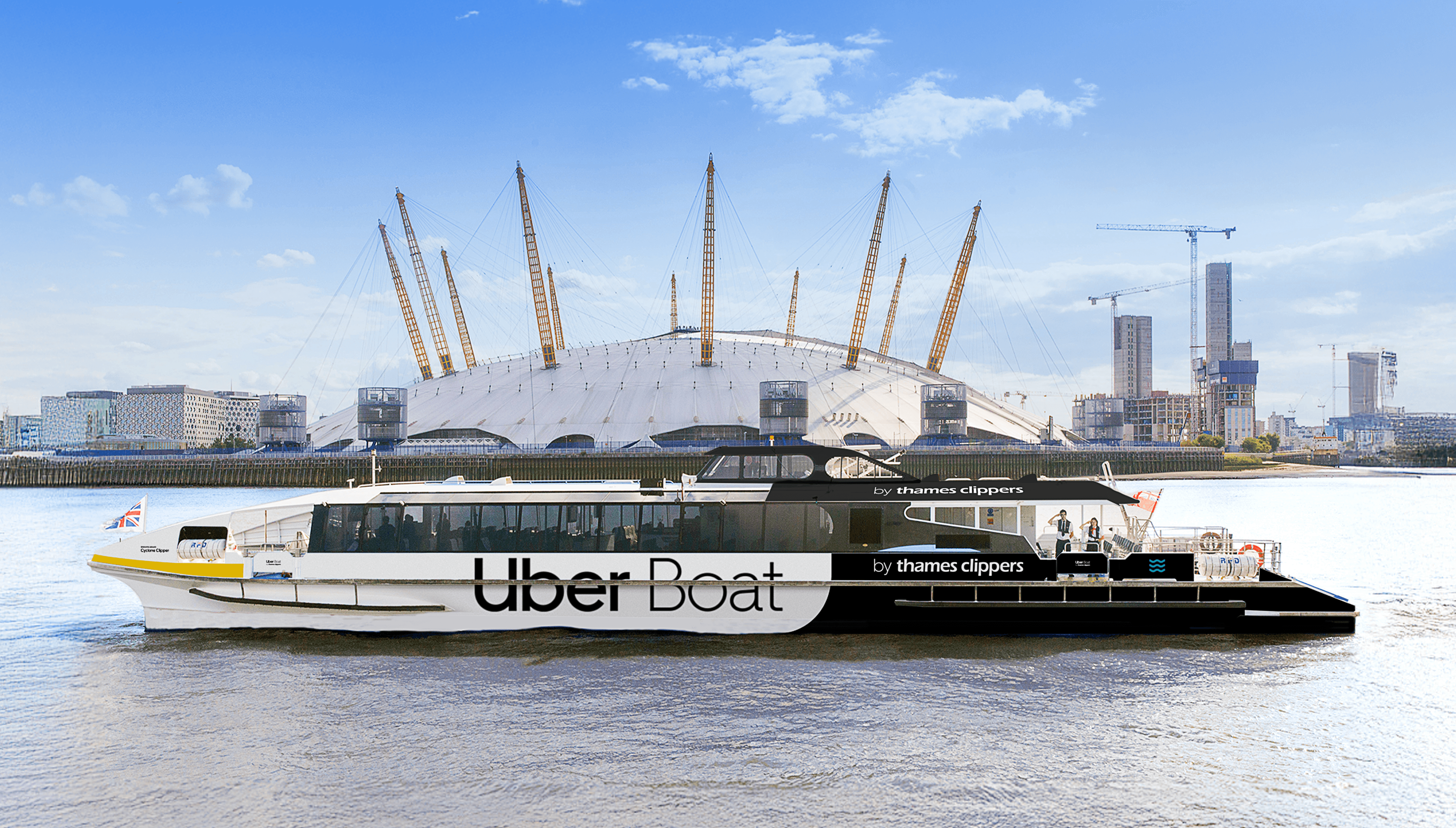
We also partnered on various projects to extend its offer even further, continuing to bring the brand to life in the physical world. One of these was Uber Boat, a joint venture with Thames Clippers in London.
Another was Uber Travel. In 2022, Uber was turbo-charging the Global Go Anywhere multimodal vision by integrating the booking of Trains, Planes, Coaches, Car Hire, Accommodation, Experiences and a Smart Itinerary into the Uber app. This was a pilot test led by the UK team.
We helped paint a picture of how customers would experience the new Uber travel ecosystem in the future. We mapped multiple future consumer journeys, brainstormed 60+ ideas for an authentic and distinctive experience, tested them with consumers, iterated and prototyped. From there, we prioritised key innovations for travel (building upon Uber’s ambitions to build new products and services), developed the “travel smarter” new positioning, and a consumer proposition to “keep travelers a step ahead at every stage of the journey”. This work launched in the UK as a proof of concept that can be rolled out globally in a modular fashion.
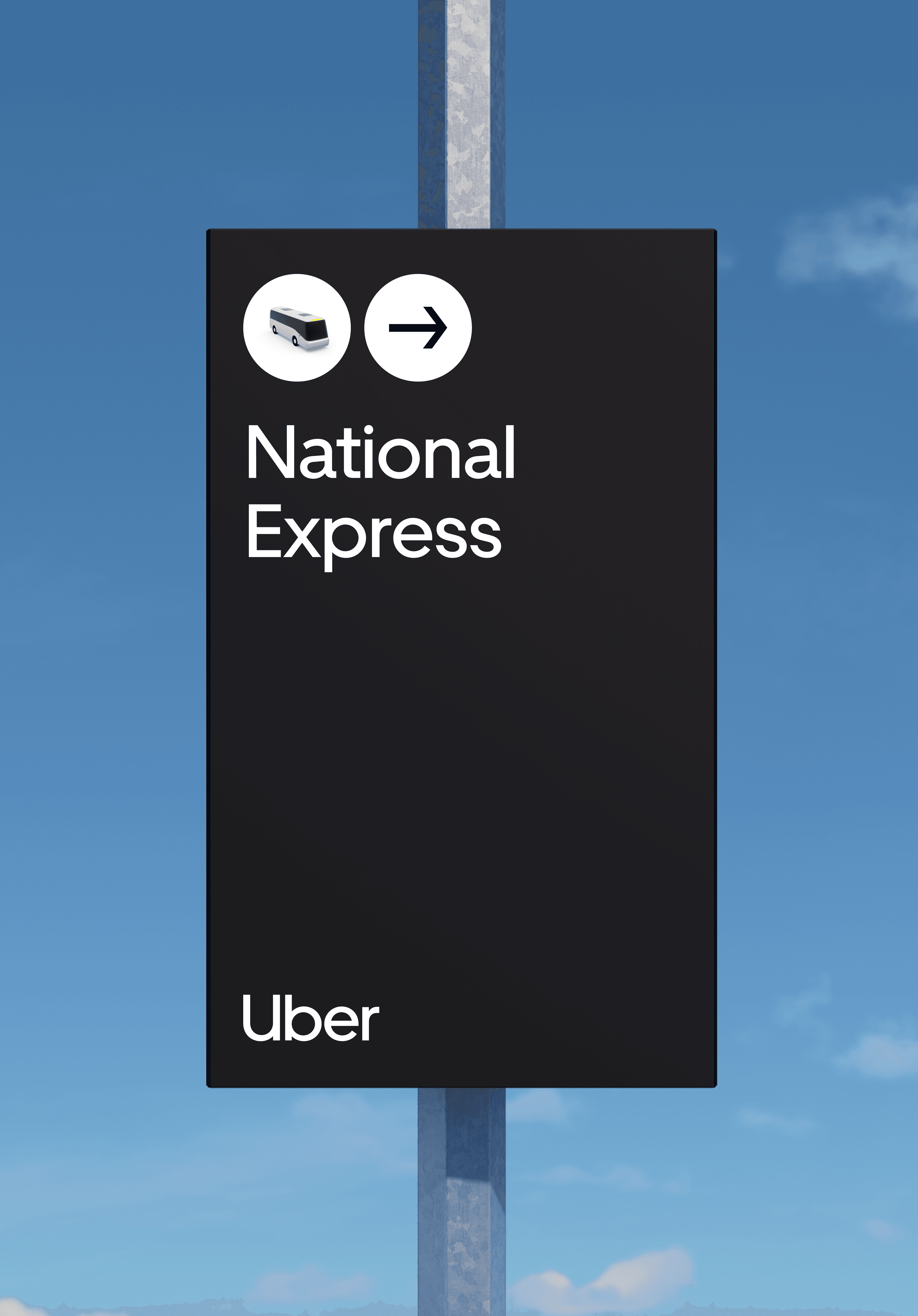
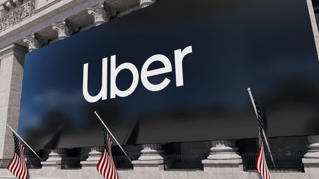
The impact of this work, firmly rooted in company culture, can be seen creatively and commercially. We’re proud of our role supporting the leadership team who enabled this turn-around. The company saw a 51% increase in brand value ahead of their initial IPO and Uber’s stock is at an all-time high in 2025.
“Wolff Olins partnered with us to deliver brand trainings and build a creative review process—not only to ensure brand consistency, but to elevate the final creative output to new heights.”
Dan Henessey, International Creative Director at Uber

